VCE Visual Communication Design students examine the role of visual language when communicating ideas, solving problems and influencing behaviours.
They explore how designers visually communicate concepts when designing messages, objects, environments and interactive experiences.
The selected works are excellent examples of students employing a design process, together with divergent and convergent thinking strategies, to discover, define, develop and deliver design solutions. They have created their visual communications through manual and digital methods, media and materials with design elements and principles.
Moses Abdelmalak
Carey Baptist Grammar School, Kew
Wurundjeri Woi Wurrung Country
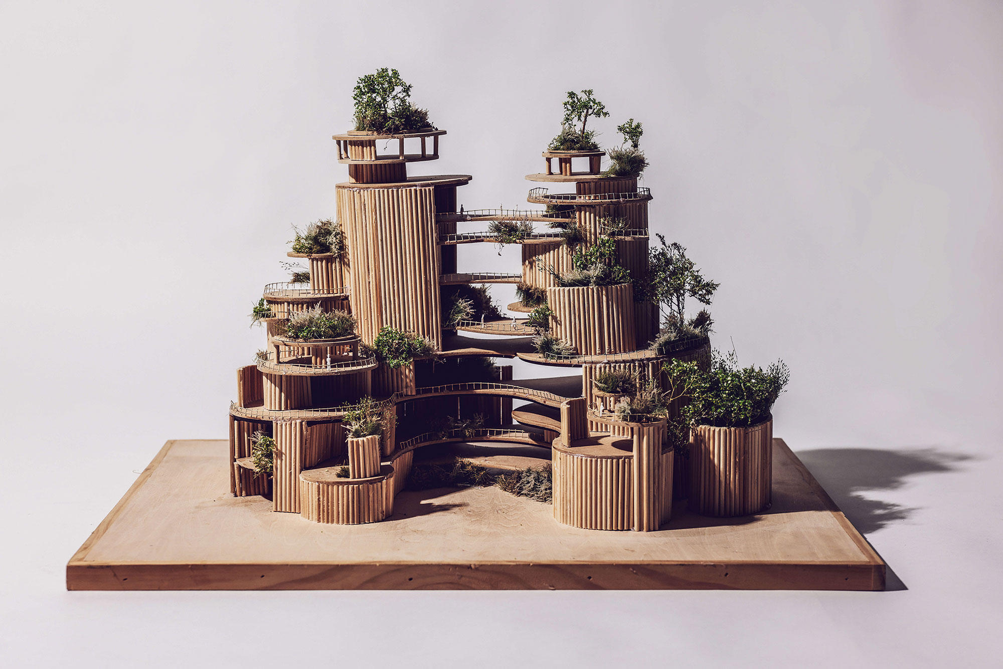
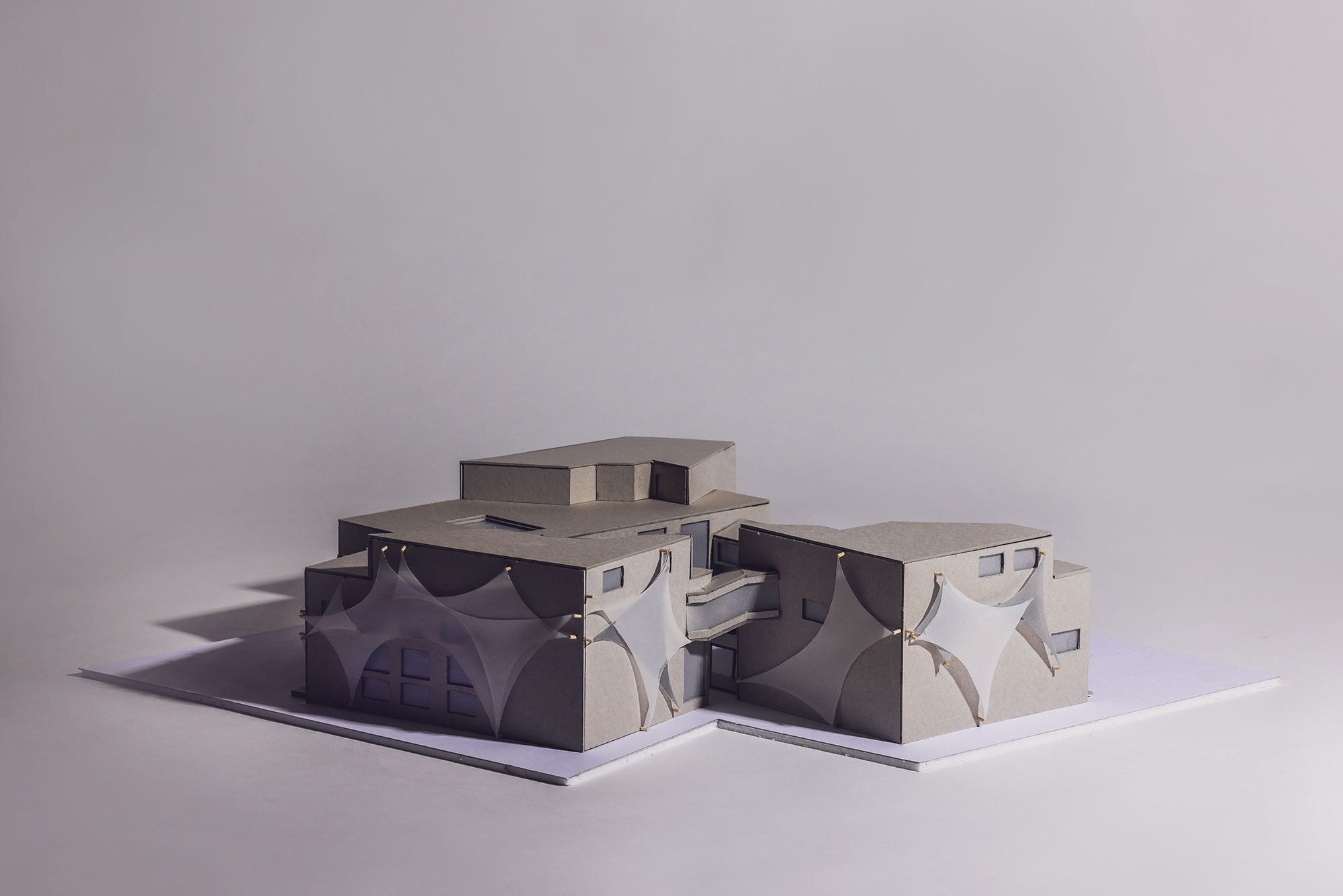
Sora Refugee Centre
Sora Presentation Board and Model
Bamboo, Medium-density fireboard (MDF), steel, glue binder, faux foliage
Sora Support App
Foam board, vector-based software
The purpose of my designs is to restore the self-worth of refugees through my facility and complementary app, supporting their first steps in building a new life for their families. Using Rhino, D5 and Illustrator, I created a bamboo prototype and a refined, user-friendly yet sophisticated app. Together, these tools foster a smooth transition and guide users through a new cultural environment as they establish stability and confidence.
Natasha Apostolovska
Rosehill Secondary College, Niddrie
Wurundjeri Woi Wurrung Country
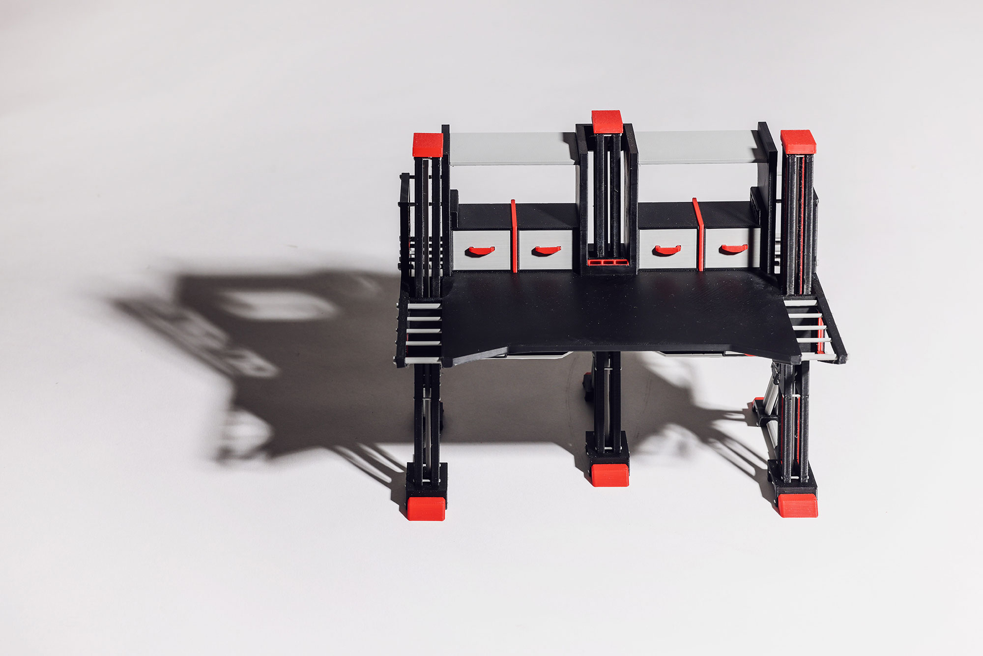
Chassis – Altera Fusion
Workbench
Polylactic Acid (PLA) 3D-print, mounted digital print, 3mm Polyvinyl Chloride (PVC) board
Company branding
Mounted digital print, 3mm Polyvinyl Chloride (PVC) board
Altera Fusion required a multifunctional workbench for a variety of industrial workspace users, catering for light to heavy workloads, with a distinct brand identity. I utilised traditional sketching and digital 3D modelling for the workbench design. High contrast, minimal colours and complex forms ensured an eye-catching industrial aesthetic.
Charlotte Chaung
Huntingtower School, Mount Waverley
Wurundjeri Woi Wurrung Country
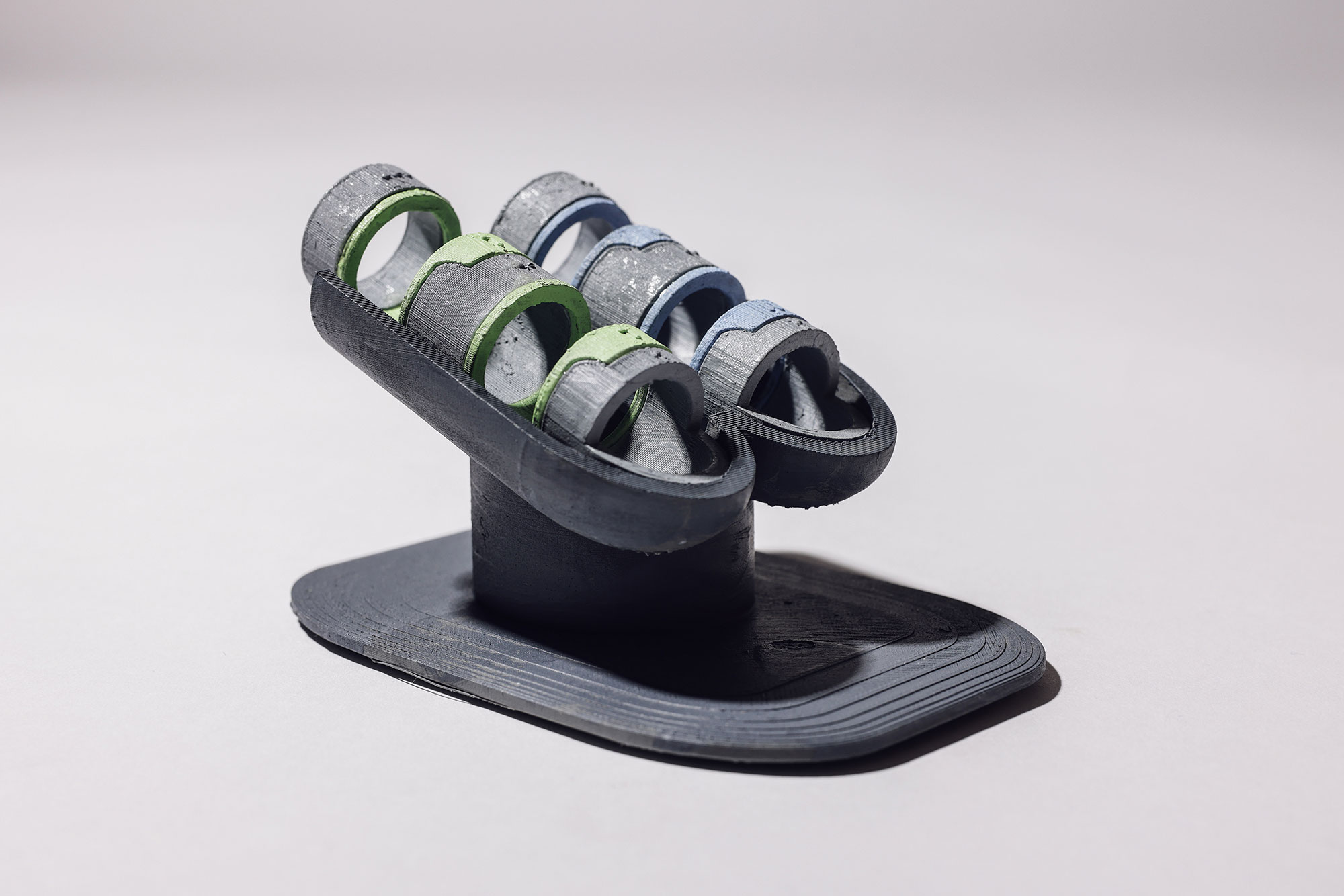
Empower Hand Device
Model and information pamphlet
Polylactic Acid (PLA), (Pompeii Gray)-500g, spray paint, inkjet print, paper
Packaging design and promotional poster
Inkjet print, paper
The client, Reuben Mikimoto, wanted to enhance the experience of the target audience (15–30-year-old physically disabled people) when using available devices in their everyday lives, while also reducing discomfort for them. The client also required a means of packaging the device as well as promotional material. The designs created aim to suit the daily needs of the users in their daily lifestyle and ensure they have safe and enhanced experiences.
Marley Cox
Ivanhoe Grammar School, Ivanhoe
Wurundjeri Woi Wurrung Country
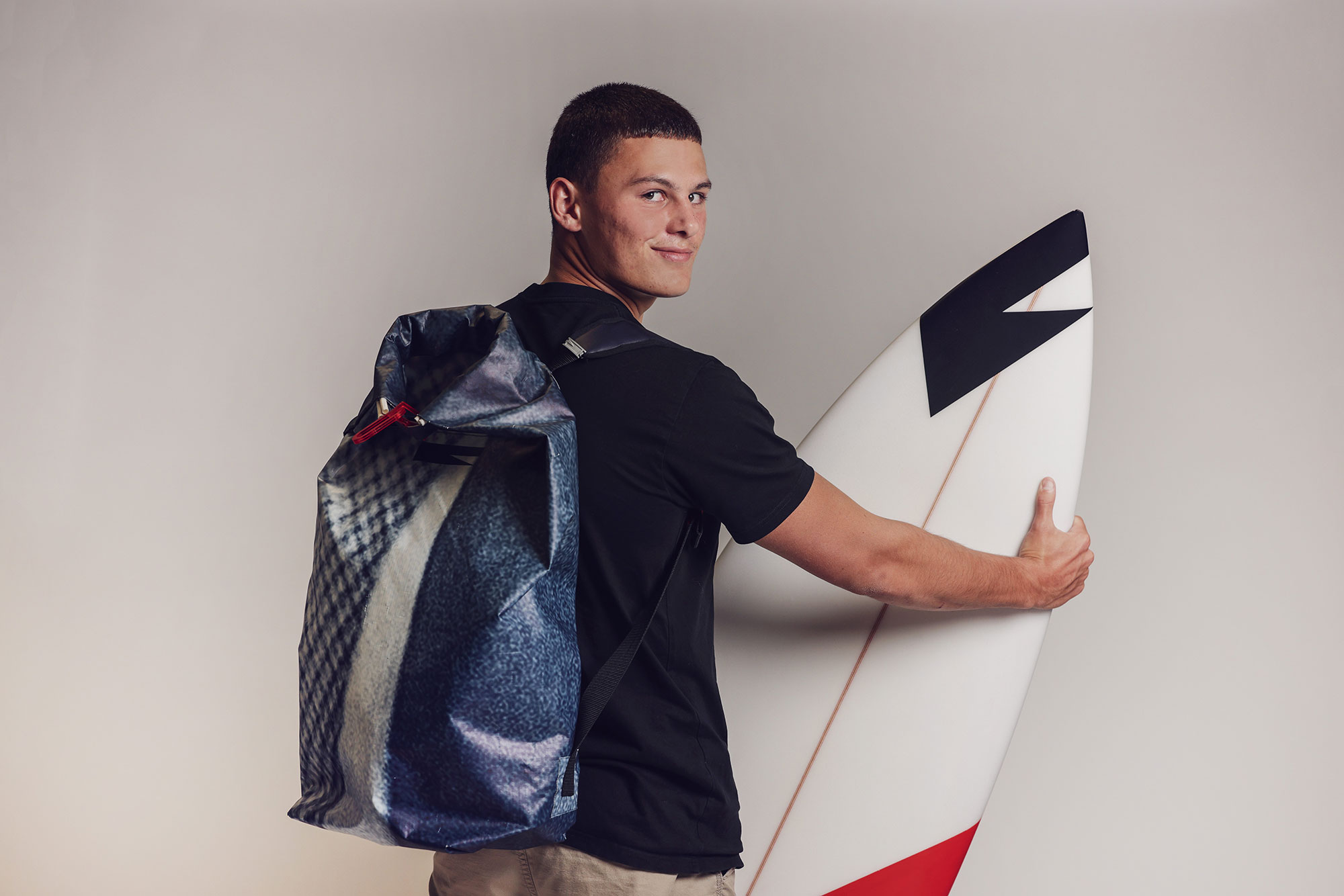
ROCAL – Contemporary Surf Brand
Brand identity, advertisement and surf wax packaging
Inkjet print, card, vinyl, beeswax, candle wax, spray paint
Waterproof backpack
Upcycled Polyvinyl Chloride (PVC) advertisement tarp, acrylic, nylon webbing, rubber, thermoplastic polyurethane seam tape, polyurethane zipper and thread
ROCAL is a contemporary surf brand targeted at surfers who value minimalism, sustainability and practical gear. The branding embraces coastal elements alongside modern design movements. The identity of the brand was developed with simple colours and shapes in mind. Physical prototyping and detailed technical flats guided the construction of the waterproof backpack, and the brand’s identity guided many aspects of the visual design. This can be seen across all contexts including the bag, surfboard and surf wax packaging.
Cate Eimutis
Melbourne Girls' College, Richmond
Wurundjeri Woi Wurrung Country
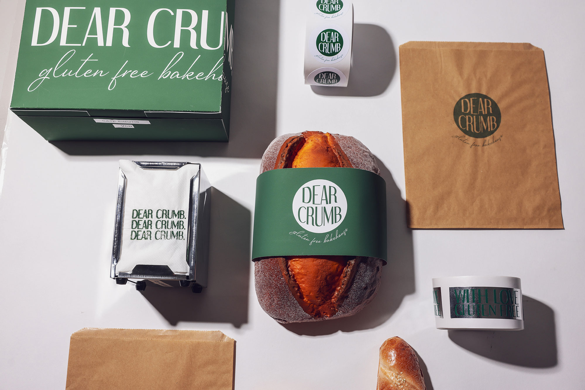
Dear Crumb Bakery
Store layout and design
Card, concrete, wood, plastic
Brand identity
Inkjet print, paper, fabric
Dear Crumb is a gluten-free bakery concept based in Fitzroy, Melbourne. The client required the design of a functional, stylish and welcoming bakery environment, to communicate the bakery’s interior layout, using both modelling and digital methods. It is paired with the establishment of a complementary branding identity that utilises minimalistic type, simple shape and distinct colour acting in a versatile and adaptable manner, while also informing customers of gluten-free safety. Simultaneously, it is advertising the business.
Sophie Hine
Siena College, Camberwell
Wurundjeri Woi Wurrung Country
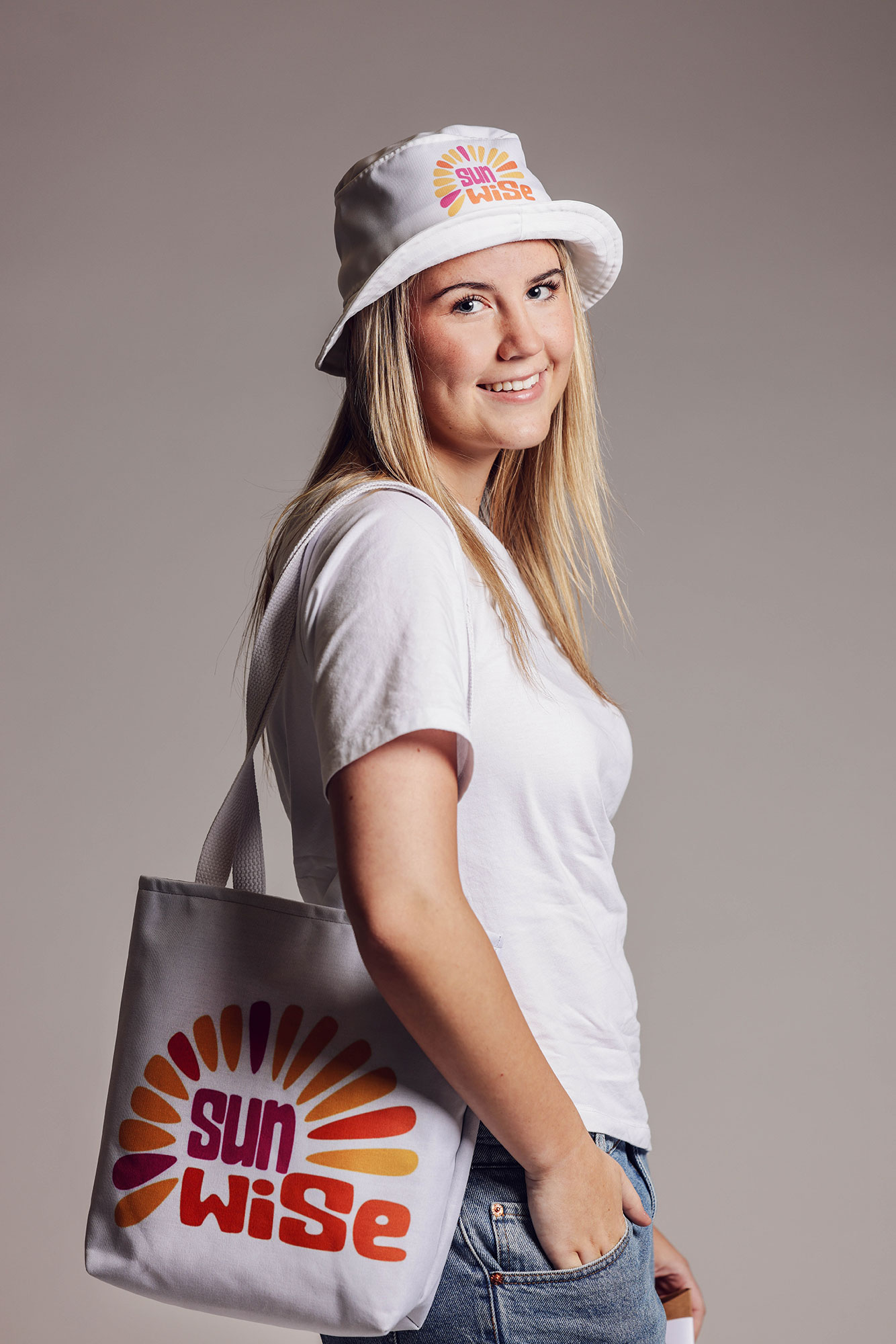
SunWise Campaign
Presentation board including logo and style guide with accompanying 3D merchandise
190gm matt paper, foam board
Series of SunWise promotional posters
190gm matt paper, foam board
Cancer Council Victoria are seeking to create a new SunSmart campaign specifically targeting a youth audience of 16–30-year-olds. This particular age group is currently at high risk due to their desire to tan, driven by fashion trends, social media and peer group pressure. The new campaign needs to connect and engage with this youth market through contemporary and socially relevant messaging, while ensuring that all communications (including a new logo, merchandise and promotional poster series) align with the trusted SunSmart brand.
Daisy Hinton
Mentone Grammar School, Mentone
Boon Wurrung Bunurong Country
Little Bay Coastal Reserve
Brand identity
Inkjet print, paper
Pier and lookout
Inkjet print, paper, balsa wood, wire
Little Bay Coastal Reserve's new brand identity and pier redesign was commissioned by Mike Shelly, the director of Rookery, Alder & Co Conservation, which prioritises protection of the fairy penguins, restores ecosystems and strengthens habitat resilience. A clean silhouette, high-contrast colours and respectfully stylised penguins attract a broad audience while maintaining professionalism. The pier redesign's accessible, durable wave-like walkway enhances visitor engagement and provides an educational and low-impact journey that guides people towards the viewing area, while safeguarding wildlife.
Katie Ho
Box Hill High School, Box Hill
Wurundjeri Woi Wurrung Country
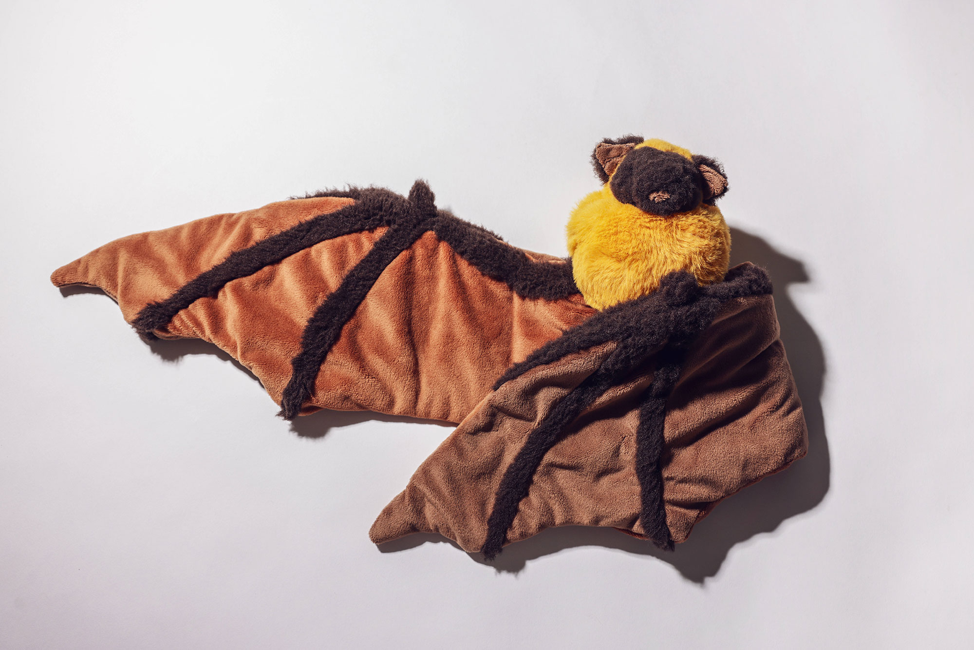
Snug as a Bug
Plush design and presentation board
Faux fur, minky fabric, microglass beads, polyester stuffing
Brand Guidelines booklet and Style Guide presentation board
Inkjet print, paper, foam core
Snug as a Bug is an organisation that caters to older teens and young adults who are autistic and/or experience sensory sensitivities. They required a product that provides physical and emotional comfort for its target audience, alongside a comprehensive brand identity. A combination of soft textures, warm tones and weighted features achieve a comforting and functional plush design. The Brand Guideline booklet utilises earthy-tones, playful imagery and clear typography to reflect the comfort and accessibility for which the client strives.
Kit Howard-West
Yarra Valley Grammar, Ringwood
Wurundjeri Woi Wurrung Country
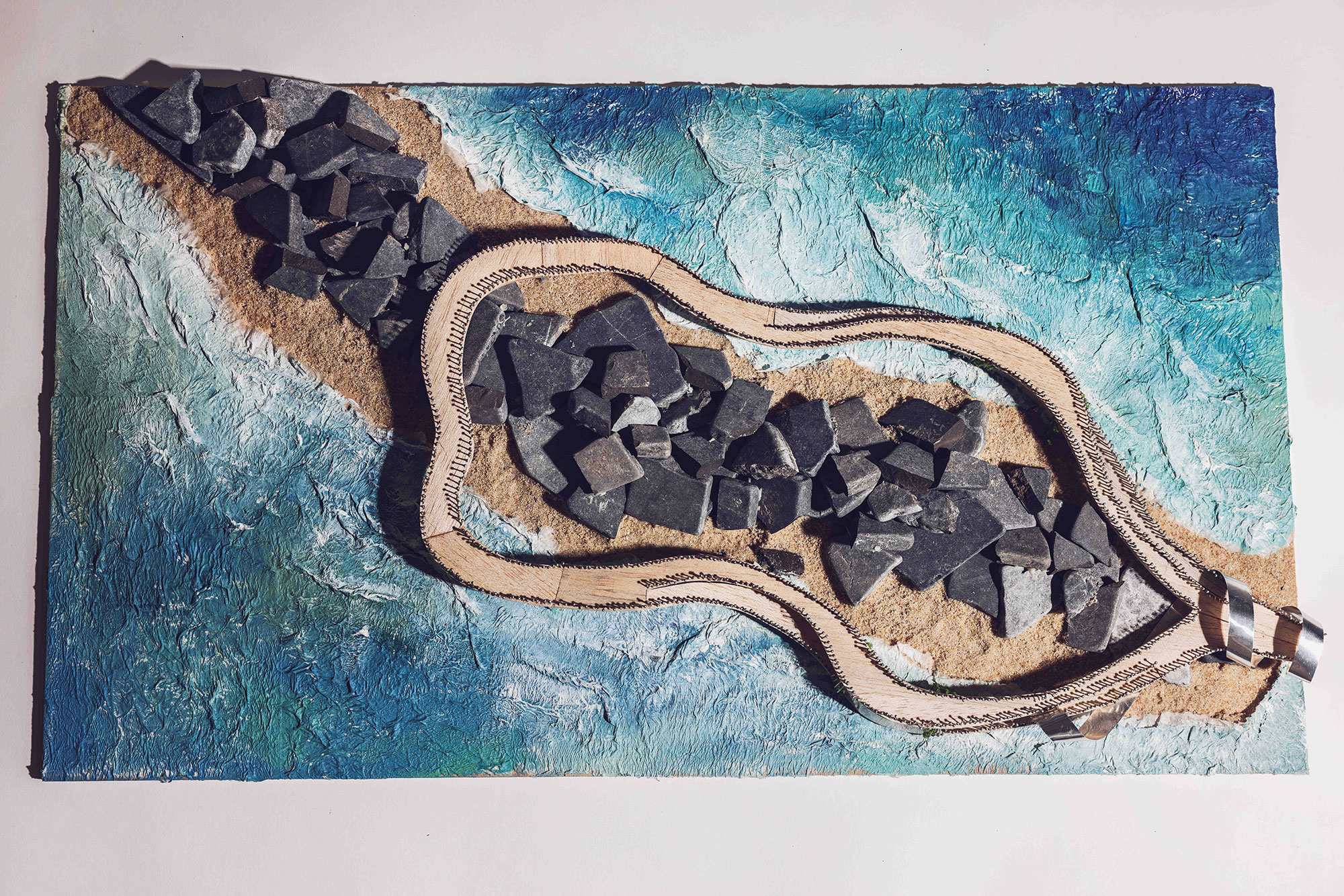
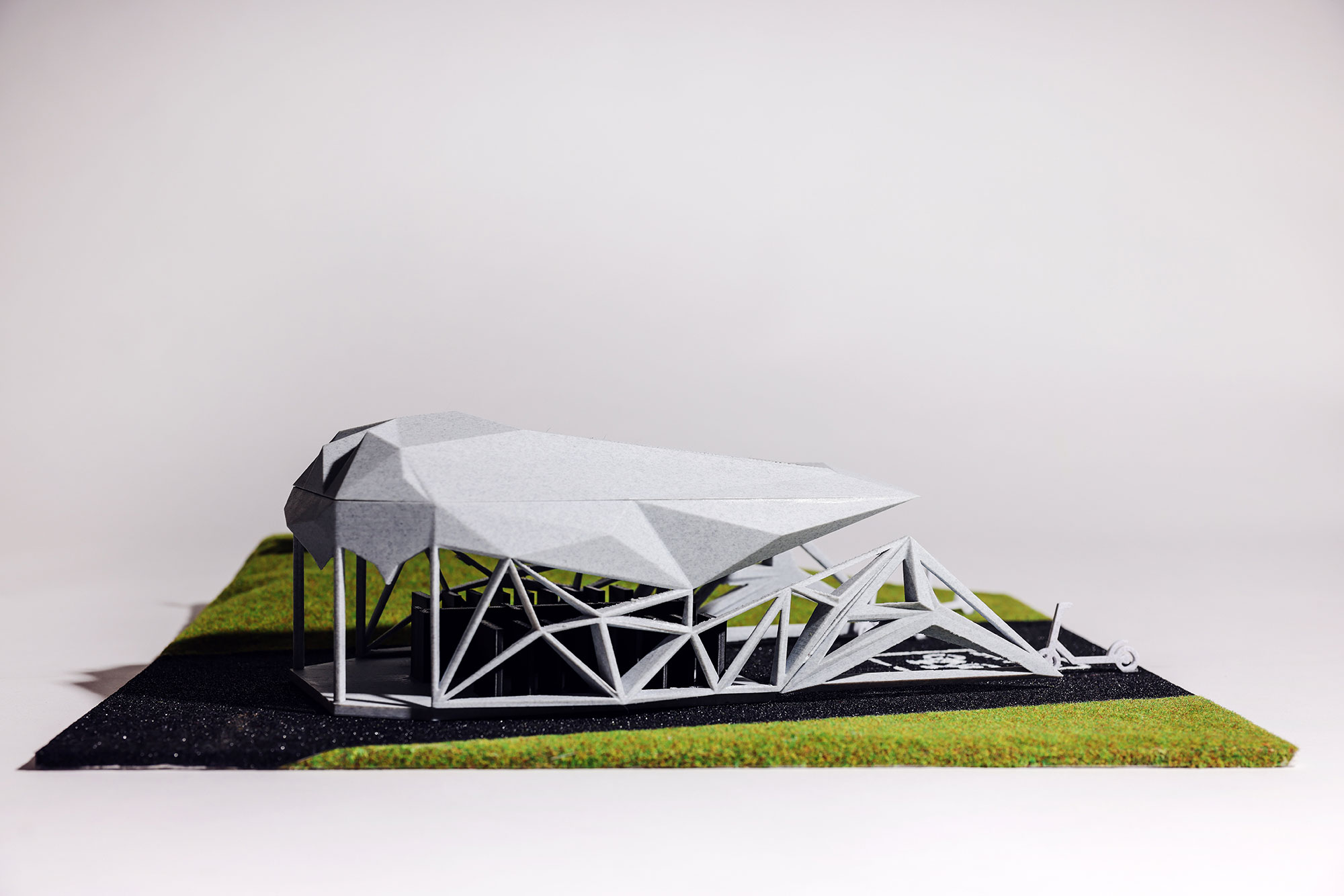
Harmony Community Music Program
Community Music Centre model and presentation board
Inkjet printer, foam core, Acrylonitrile Butadiene Styrene(ABS), acrylic
Wayfinding system, logo design and presentation board
Inkjet printer, foam core, cotton
Harmony is a not-for-profit program aimed at musically-inclined but socially-disengaged youths in Melbourne's northern growth corridor. The angular and open-plan music centre, designed to fit on a standard suburban plot, emphasises reconfigurability and social and spatial interconnectedness. Likewise, the logo seeks to capture a timeless yet warm and inviting aesthetic, while the wayfinding seeks to improve the centre's accessibility. The record needle motif is present across both logo and centre designs.
Kislee Nguyen
Balwyn High School, Balwyn North
Wurundjeri Woi Wurrung Country
An Giang Library
Conceptual model of the library
Cardboard, wooden sticks, tracing paper, plastic sheets, foam board
Tote bag and keychains
Screenprint on canvas, acrylic, synthetic cotton string, metal components
The An Giang Provincial Library (An Giang Library) proposed a project for redesigning its space and re-establishing its branding to meet the changing needs of the local demography. I explored local legends and traditional practices to develop the form and façade of the building as well as associated and multiple examinations of shapes and functionality. Simple cursive lines, clean shape assets, a neutral colour palette, and easy-to-read typography were utilised to suit the large demographic and the modernity of the building aesthetic.
Catherine Robinson
Star of the Sea College, Brighton
Boon Wurrung Bunurong Country
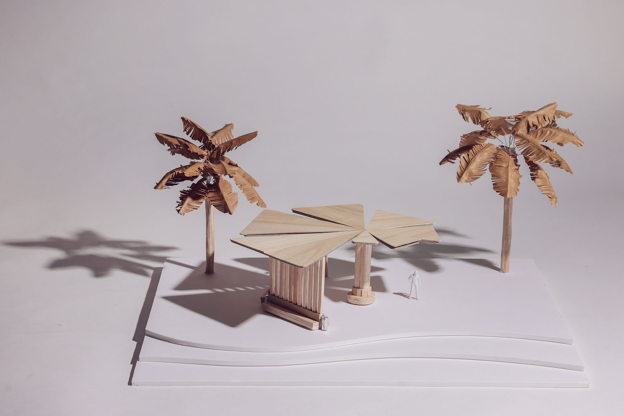
GlowGuard Sun-safe Design
GlowGuard Sunscreen packaging and Sun-Safety infographic
Inkjet print, satin paper
Sandringham Beach Shade Pavilion design
Cricut, balsa wood, card, glue, paper, wire
GlowGuard required sunscreen packaging and an infographic that would encourage young Australian women to adopt sun-safe habits. I designed vibrant, youthful packaging using digital illustration and clean, modern typography to make the sun protection factor (SPF) appealing and easy to use. The infographic presents clear, engaging information about sun protection. My second presentation features a shade pavilion for Sandringham Beach, designed with organic forms and durable materials to provide accessible, comfortable
Sienna Sullivan
Mentone Grammar School, Mentone
Boon Wurrung Bunurong Country
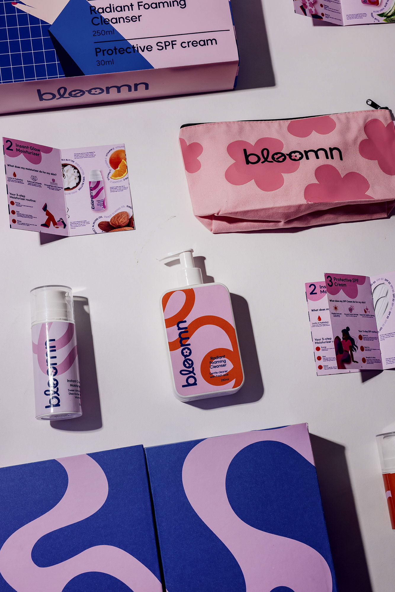
Bloomn
Branding and visual identity
Inkjet print, paper, gloss stickers, iron-on vinyl
Packaging
Inkjet print, paper, cardboard, matte sticker sheets, ribbon, magnets
Young girls often lack reliable and honest resources to learn about skincare, beauty and their bodies. Bloomn, a skincare business specialising in providing age-appropriate skincare products and bundles for tweens, aims to educate, inspire and empower young girls to care for their skin in healthy ways. Bloomn’s mission is to provide engaging, playful and inclusive educational bundles for tweens that promote natural beauty and the importance of age-appropriate skincare. Bloomn required their branding to be feminine, playful and vibrant to engage tweens and convey a youthful and friendly brand persona.
Holly White
Tintern Grammar, Ringwood East
Wurundjeri Woi Wurrung Country
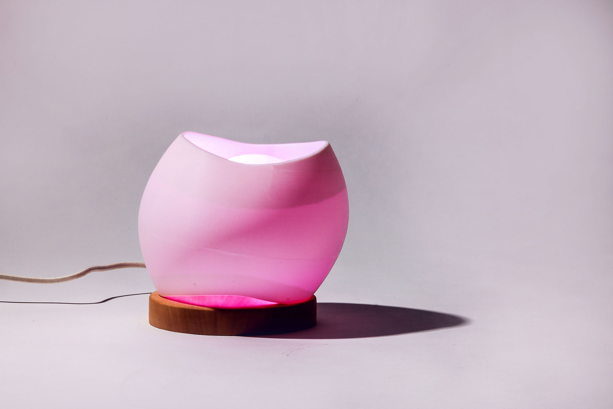
Azure & Aureate Light Sculpture
Light sculpture
Jelutong timber, plastic filament, electrical cord, smart LED WiFi E14 bulb
External light packaging and branded poster
Corrugated cardboard, card, printed ink, tissue paper
Azure & Aureate required a wellness-focused lamp for people aged 18 to 25 who want stylish, functional lighting that supports mood, focus and healthy sleep. I developed a natural, flowing form, using a 3D-printed shade and a lathe-turned wooden base. Warm-to-cool lighting connects to the body’s circadian rhythm, creating calm or clarity as needed. The packaging uses textured paper, a sturdy board box, and a day-to-night gradient to communicate the lamp’s purpose and present it as an elegant, contemporary product.
Yat Yeung
Yarra Valley Grammar, Ringwood
Wurundjeri Woi Wurrung Country
RIDE WITH A SHELL
E-Mobility shelter
Polylactic Acid (PLA) 3D-printed components, foam board, textured modelling turf, sandpaper road surface
Promotional campaign and parking map for e-mobility
Inkjet print, paper
Public Transport Victoria (PTV) required an integrated e-mobility solution to address unsafe parking, vandalism and low rider confidence. My design combines a modular shelter with a promotional campaign and parking map to support safe, organised scooter and bike use. The shelter features a flexible, sustainable structure incorporating PTV’s triangular geometry, while the campaign applies a unified visual identity. Shared colours, hierarchy and the ‘SHELL’ logo link all outcomes, with the pun referencing both shelter and helmet to reinforce safety for users.