Visual Communication Design
Designers create and communicate their ideas visually to influence everyday life for individuals and communities. VCE Visual Communication Design examines the ways visual languages can convey ideas and information in a range of design practice fields, including environments, messages, objects and user experiences.
The selected works demonstrate the use of a design process that employ divergent and convergent thinking. Students have created their visual communications through using design elements, media, materials and methods.
Sophie Balis
Caulfield Grammar School, Wheelers Hill
Wurundjeri Country
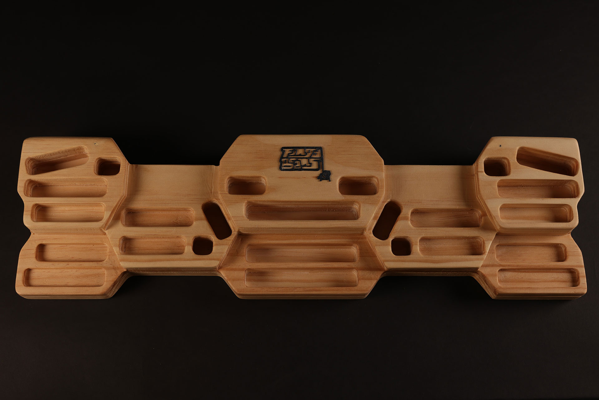
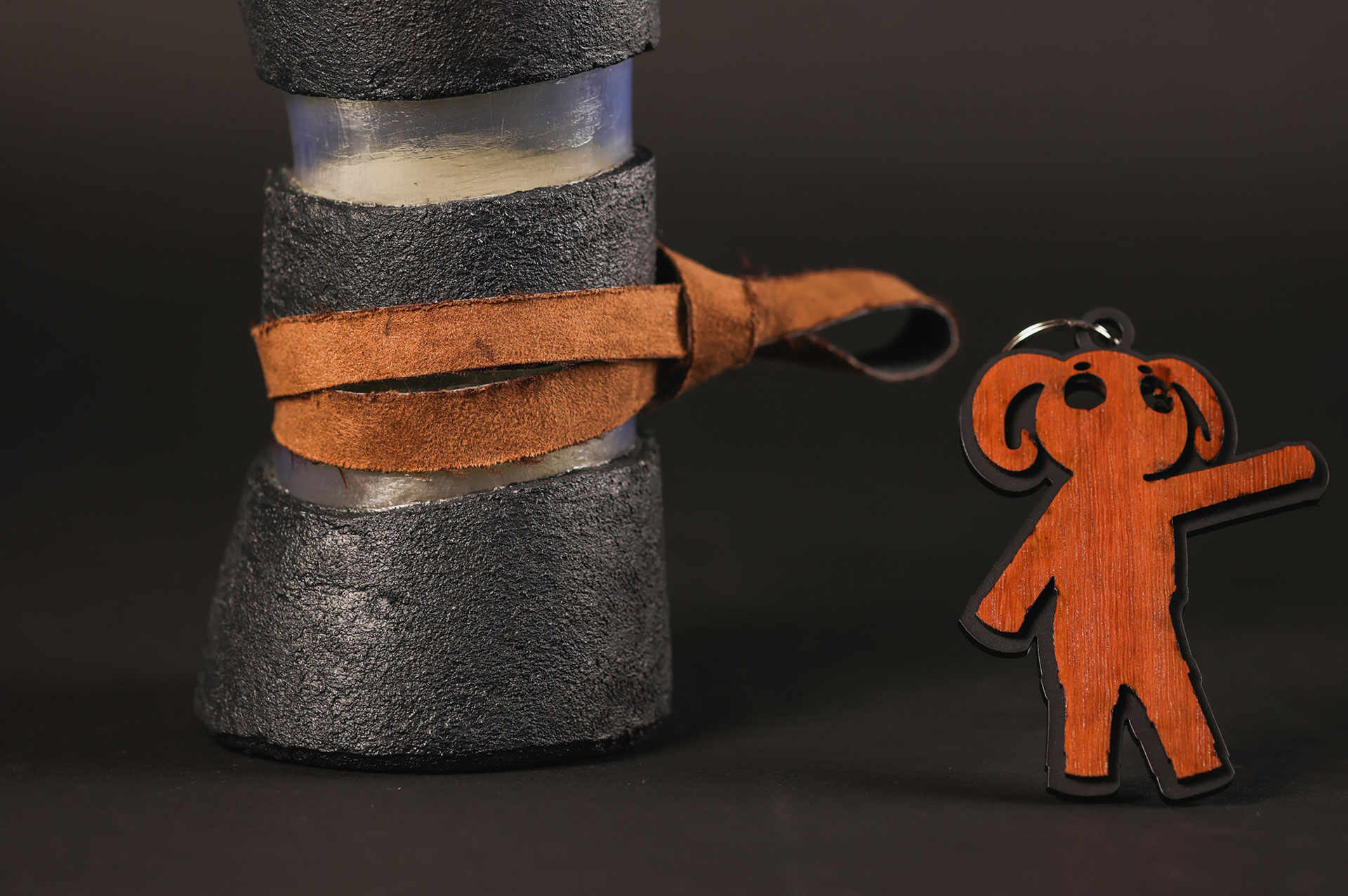
Fingy Beans Hangboard
Branding and presentation board
Inkjet print, foam core
Hangboard model and prototype
Plastic filament, pine wood
Fingy Beans is an online climbing brand that is passionate about efficient and effective training. They required a new logo and hangboard designs for intermediate to advanced climbers looking to increase their finger strength. Their goal was to provide climbers with a flexible and beneficial training tool. The hangboard includes a range of hold types and depths to allow for a variety of training styles to be performed on a single board.
Phoebe Biggin
Methodist Ladies’ College, Kew
Wurundjeri Country
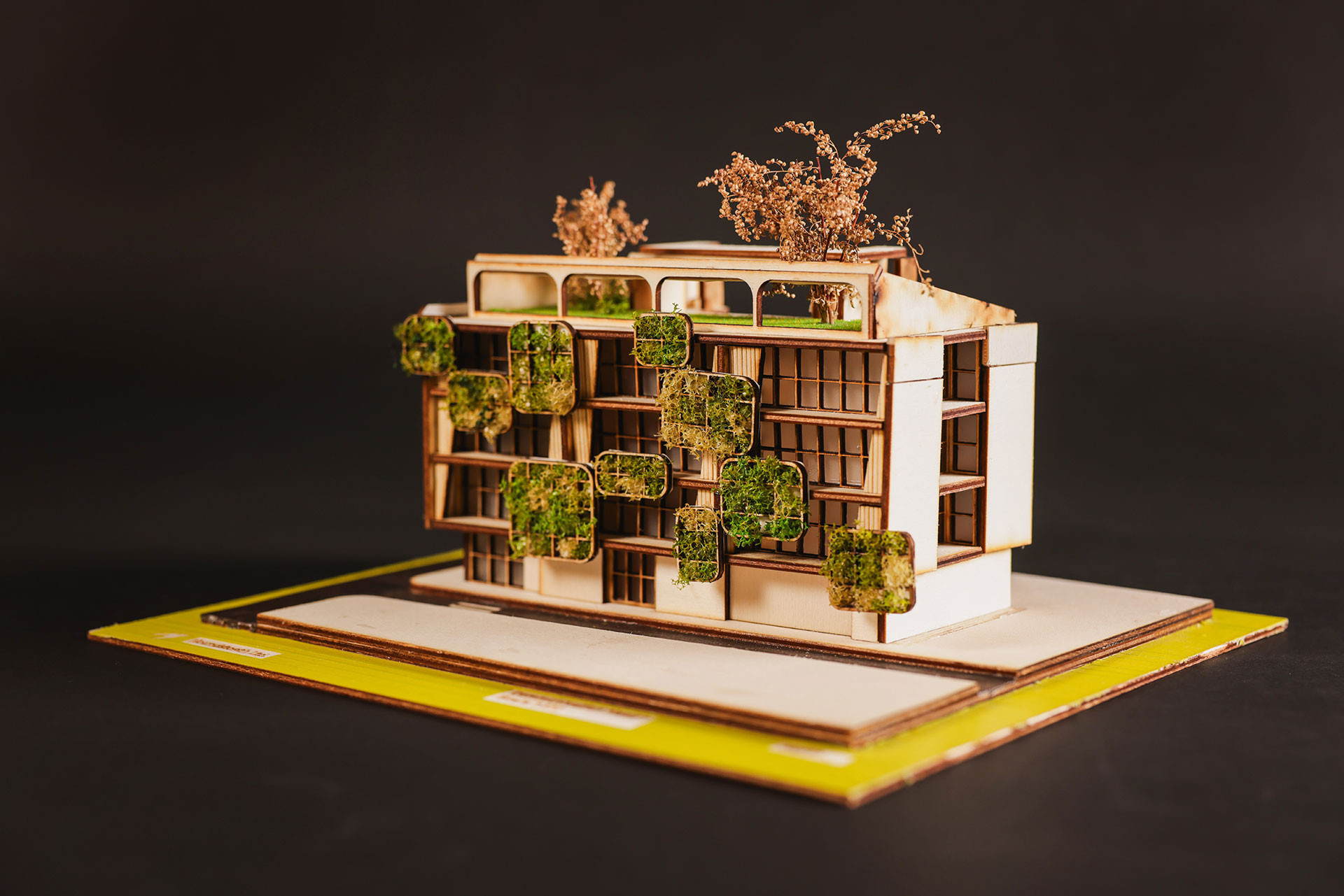
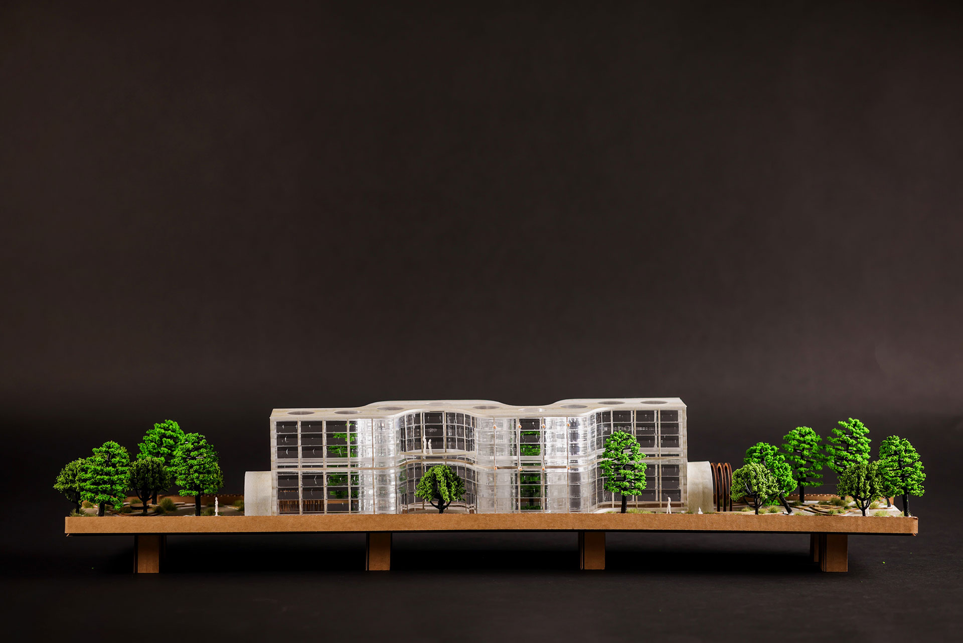
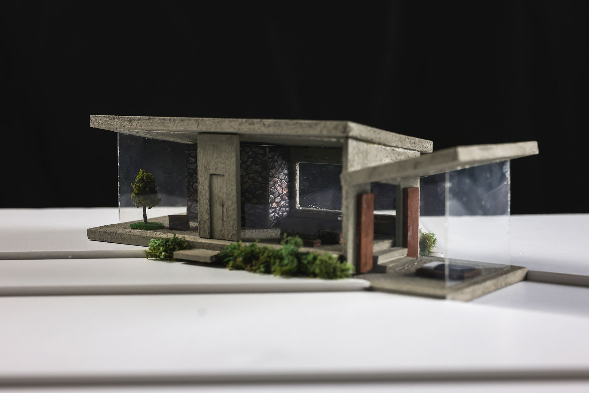
Station House
Architectural model, concept board
Poplar wood, plastic
Advertisement brochure, concept board
Inkjet print, paper, plastic
Station House is a medium density apartment complex designed for Houndstooth Ltd. Presented as part of a development concept, my vision for Station House was to be an integration of organic and modern forms of design. I wanted the complex to reflect community ideals and the needs of an interaction-oriented population. My design uses wide open area spaces, green wall inclusions, and other features to suit the lives of growing families and achieve sustainable and aesthetic outcomes for all residents.
Hannah Cook
Northcote High School, Northcote
Wurundjeri Country
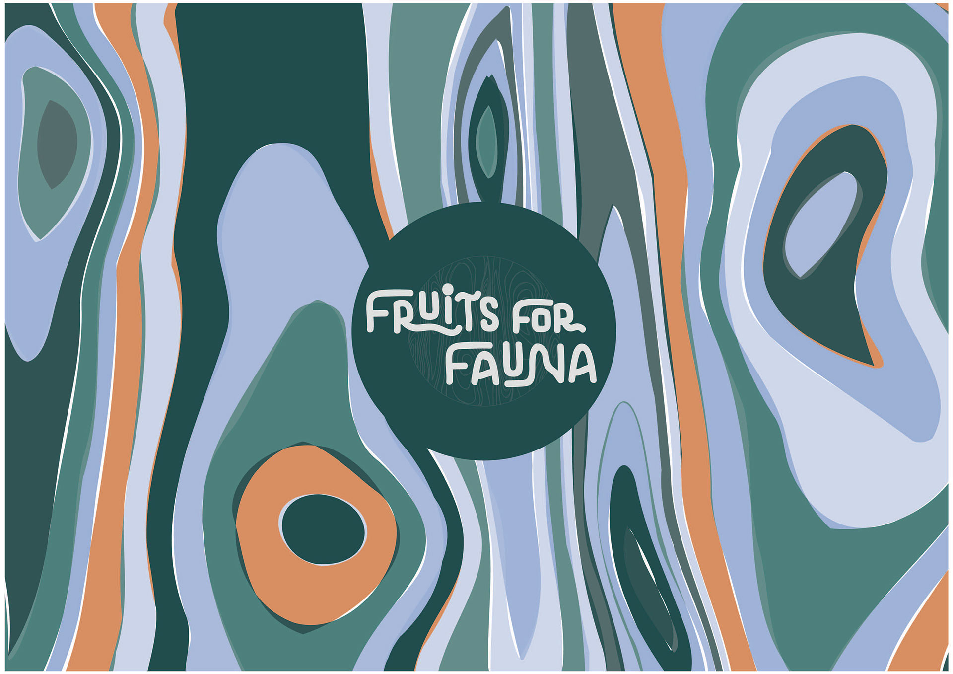
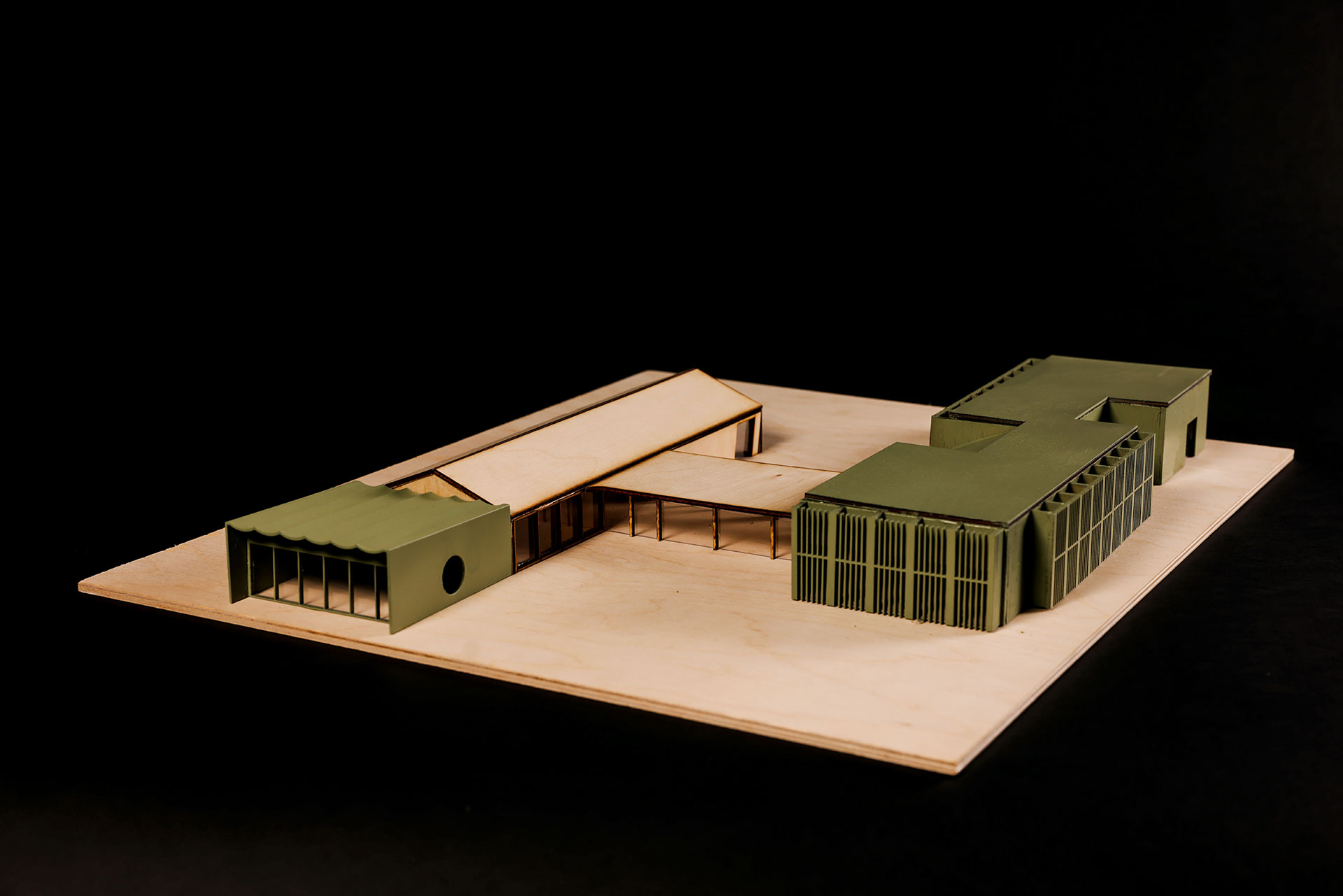
Fruits For Fauna
3D architectural model and presentation board
Laser cut wood, cardboard, foam core, inkjet print
Logo and visual identity
Inkjet print, foam core, paper
Fruits For Fauna is a small business that aims to protect endangered wildlife and conserve the environment. They required a sustainably designed café and education hub to be situated on Mount Buller, accompanied by a visual identity to promote the brand. The green roof of the café provides insulation and protection from alpine weather while also helping the building blend into the landscape. Inspired by snow gum trees, the logo features seasonal colours and a unique illustration that represents nature.
April Crumpler
Ballarat Clarendon College, Newington
Wadawurrung Wathaurong Country
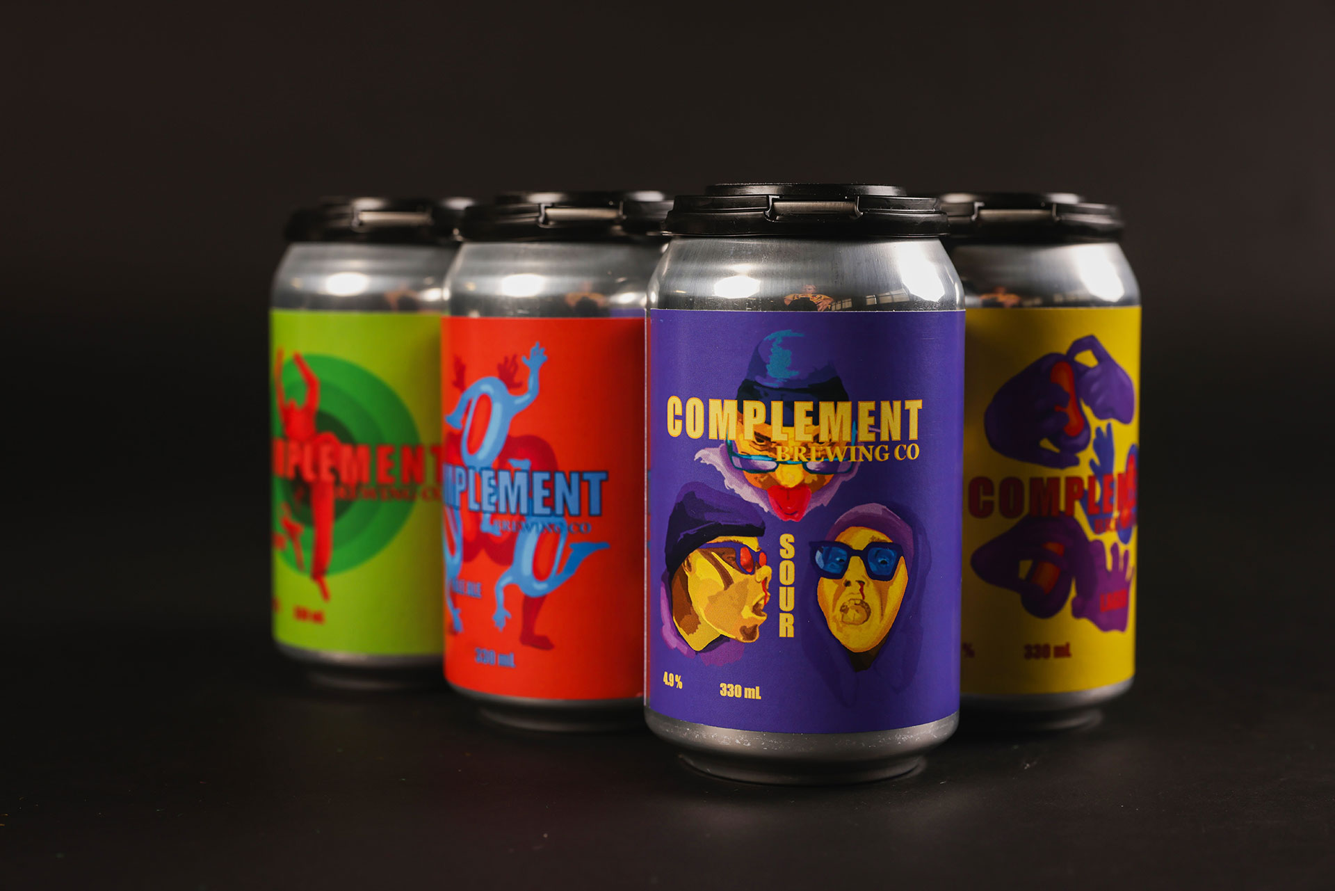
Complement Brewing Company
Beer can label designs
Inkjet print, mount board, sticker paper, aluminium cans
3D model of a proposed brewery
3D print filament, model trees and figures, balsa wood
Complement Brewing Company required a set of graphic labels for the 6 different beer cans they produce, all following a complementary colour scheme of yellow/purple, blue/orange, and red/green. I used digital methods to produce the sticker labels and adhered them to aluminium cans. Complement Brewery also required a 3D model to present a proposed brewery design that would show the contemporary, vibrant nature of the business and their passion for brewing.
Alyssa Cunanan
Williamstown High School, Williamstown
Bunurong Boonwurrung Country
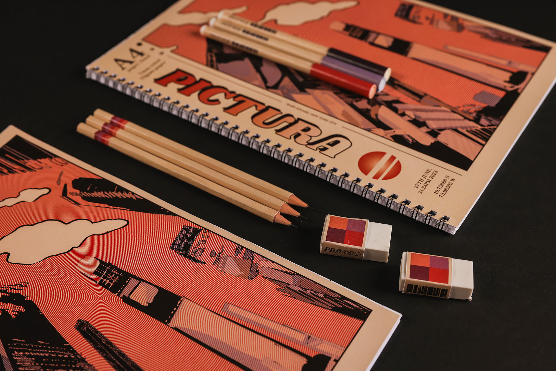
Pictura
Flagship Pictura store
Plastic filament, paper
Stationery set
Pencils, pens, inkjet print, paper
Pictura is a stationery store located in Fitzroy, Melbourne. The storefront is inspired by retro aesthetics, traditional shopfronts, contemporary arts, and prominent architecture throughout the suburb. A limited edition stationery set has been designed to celebrate the shop's opening, which pays homage to early-internet East Asian shows such as Cowboy Bebop and Perfect Blue, key inspirations of the owner Ann Che’s work.
Joseph Dinh
Mazenod College, Mulgrave
Bunurong Boonwurrung Country
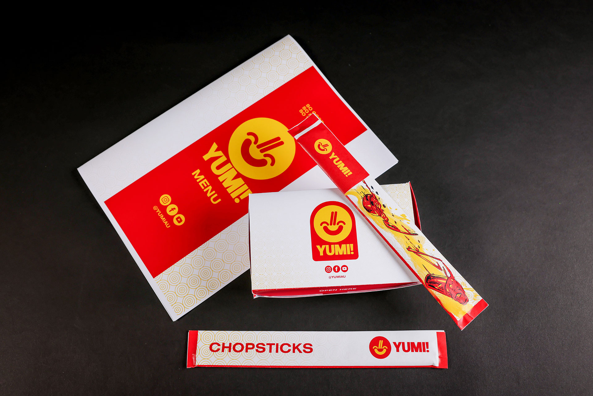
Yumi Restaurant
Brand design and packaging
Inkjet print, card, paper
3D model and promotional flyer
Inkjet print, bamboo panels and paper
Yumi is a restaurant chain owned by chef Aaron Tran and owner Shue Dang, who are in the process of opening a new family-run Vietnamese restaurant in Springvale. They are looking for a modern and distinct brand identity for their restaurants, including packaging. The architectural model of Yumi’s modern interior and exterior views depicts the unique environmental design, which distinguishes it from existing restaurants.
Amelie Dyer
Huntingtower School, Mount Waverley
Wurundjeri Country
Arizona
Drink bottle and presentation board
Resin, plaster and inkjet print
Mascot and presentation board
Wood and inkjet print
Arizona is a large US based company providing climbing accessories to an international audience. The company’s ethos is to blend practical and elegant design. I focused on a highly functional design for the drink bottle that is both compactable and effortlessly attachable to meet the climber's needs while ascending. The accompanying mascot, inspired by the rugged spirit of the mountain goat, entwines authenticity and resilience into Arizona's brand identity.
Phoebe Kupsch
Wurun Senior Campus, North Fitzroy
Wurundjeri Country
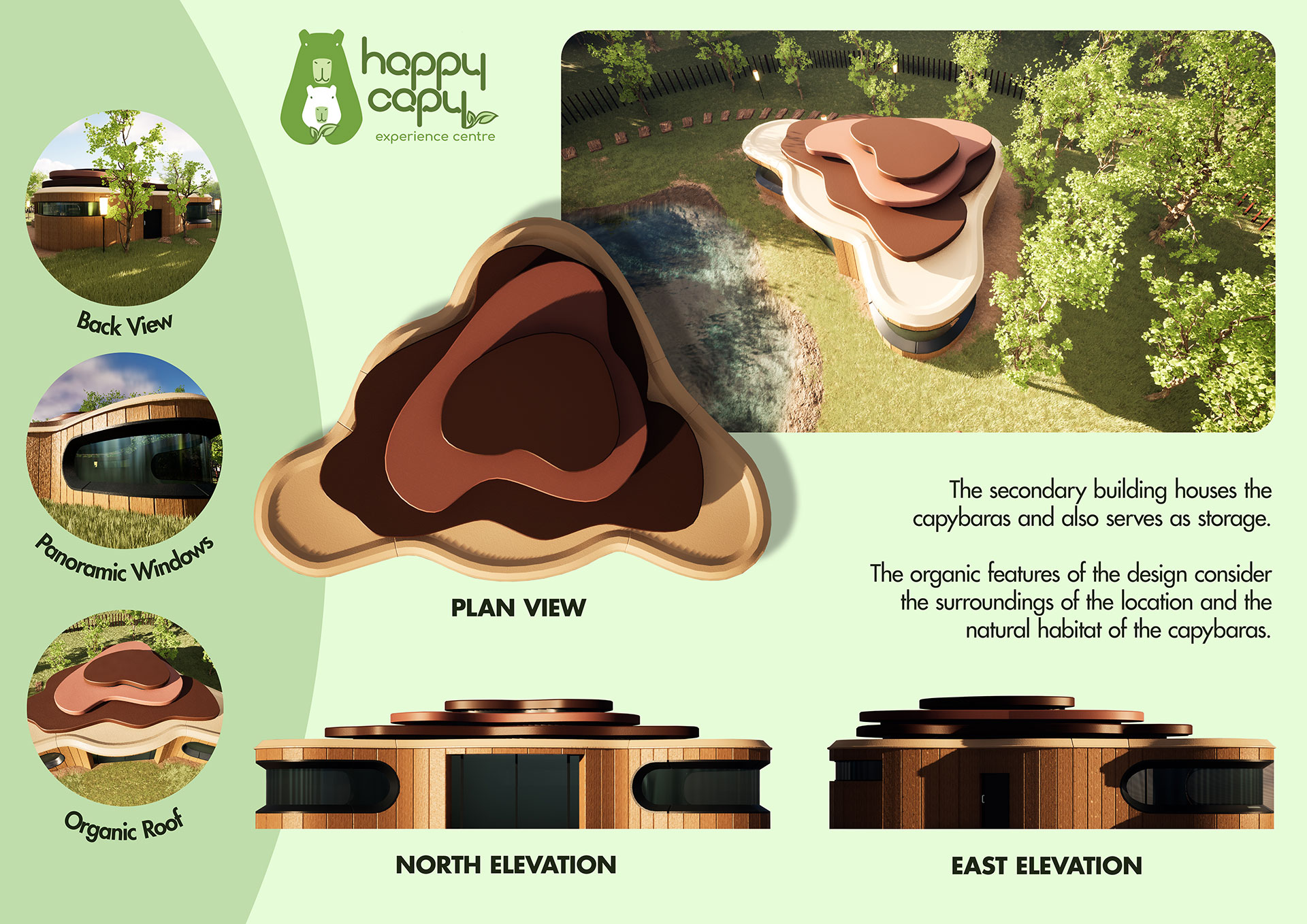
Happycapy
Happycapy experience centre
Inkjet print, paper, foam core, virtual architectural model
Logo identity and phone application
Inkjet print, paper, foam core
Happy Sparks is a not-for-profit organization that has been providing key services relating to mental health in Australian communities for over 20 years. Happy Sparks wanted to base their therapy around capybaras, given their placid temperament and social nature, and develop an experience centre called Happycapy. Happycapy’s logo and experience centre have been designed to appeal to Melbourne residents aged 4 to 65, while also carefully considering the surroundings of the location and natural habitat of the capybaras. The accompanying phone app ensures a continuous interactive experience, extending mental health benefits beyond the centre itself.
Ethan Leong
Mount Waverley Secondary College, Mount Waverley
Wurundjeri Country
Bendigo Contemporary
Style guide and motion graphic
Inkjet print, paper, digital methods
Presentation boards and model
Inkjet print, paper, mounting board, card, resin
Bendigo Council required a design for a new contemporary art gallery along with a distinct brand identity aimed at young adults and tourists. I used both traditional and digital methods to create detailed architectural presentation boards and a model that accurately depicts form and scale. I used simple shapes and typography to create a minimalistic and modern aesthetic for the brand.
Ruby McInnes
Lowther Hall Anglican Grammar School, Essendon
Wurundjeri Country
Artfull Community Art Centre
Concept board and model
Plywood, foam core
Promotional poster, style guide, business card and apron
Card, fabric, foam core
Artfull Community Art Centre is located in the growing suburb of Williams Landing. The facility provides development opportunities for local artists as well as classes for community members that cater to a range of ages and abilities. The Centre incorporates a balance of space for both recreational and work activities, providing multifunctional community benefits. I created an accessible building design alongside artistic branding to promote the new facility.
Holly McNamara
Lauriston Girls’ School, Armadale
Wurundjeri Country
COO-EE Native Botanical Museum
Promotional material and brand identity
Inkjet print, card, paper, foam core
Architectural model and presentation board
Perspex, wood, paper, glue, cardboard, card, foam core
The Horticulturalist Society of Victoria wanted to renew city spaces by bringing Australian native flora to Melbourne through their new project, the Native Botanical Museum. The Society required a clear brand identity and promotional material, as well as architectural and landscape designs for the museum. The COO-EE Native Botanical Museum and promotional material were created with a vision to reflect a minimal yet innovative aesthetic, complimenting the city environment.
Joshua Roberts
Waverley Christian College, Narre Warren South
Bunurong Boonwurrung Country
The MOON Project
Logo, brand identity
Cotton t-shirt, calico fabric, acrylic paint, inkjet print, foam core, motion graphic
Architectural design
Wood veneer, plastic, spray paint, inkjet print
Elliot Lewis required a logo and architectural design for The MOON Project, a Melbourne-based organisation dedicated to creating spaces for emerging designers and artists. The unique shapes used for the logo, alongside the GIF animation, give the brand a contemporary appearance that targets a young audience aged 16 to 25. The openness of the gallery, met with the privacy of the studio hub, facilitates a space for creativity to thrive and be displayed to the public, meeting the organisational purpose.
Cooper Smith
Caroline Chisholm Catholic College, Braybrook
Bunurong Boonwurrung and Wurundjeri Countries
Woodlands & Co
3D architectural model and digital drawings
Foam core, balsa wood, inkjet print
Brand identity
Inkjet print
Woodlands & Co, a private holiday homes company, required a design for accommodation and an updated brand identity. They wanted the designs to suit a gender-neutral audience aged 20 to 55, living in Australia and looking to holiday in regional Victoria. I used a combination of model making materials to construct my model, along with digital applications such as Google SketchUp and Adobe Illustrator to create my drawings. The brand identity was designed with consideration of a modern aesthetic with links to the natural environment.
Chinan Yang
Genazzano FCJ College, Kew
Wurundjeri Country
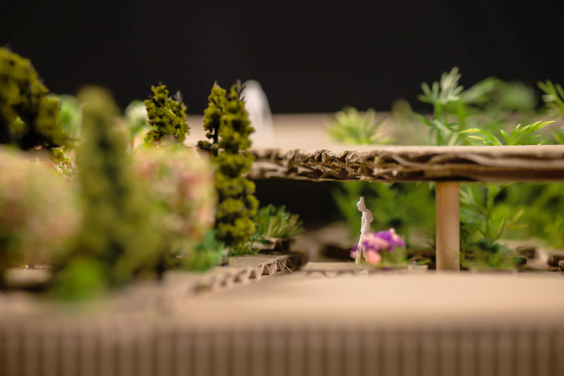
Urban Garden
Garden design
Virtual architectural model, inkjet print, paper, cardboard, artificial foliage
Plant labelling sign
Inkjet print, paper, PVC pipe, PLA plastic, acrylic
ThinkGreen is an organisation that recognises the importance of natural environments in maintaining a spatial and spiritual balance in urban areas. In response to a growing number of high rises in Melbourne’s eastern suburbs, ThinkGreen required a garden design and plant labelling signs for their urban garden. The garden aims to provide an immersive escape from the frenzy of a modern city, blending a style reminiscent of traditional Chinese architecture with a range of natural features, to create a space that embodies the five senses: sight, taste, scent, touch and sound.
Tin Lok Zhang
Camberwell Grammar School, Canterbury
Wurundjeri Country
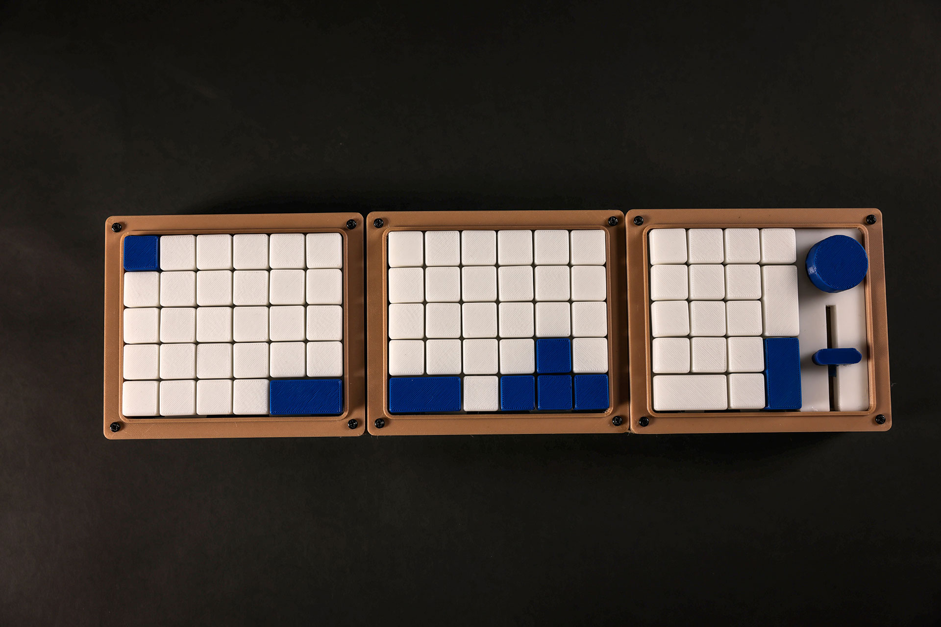
Zen+ Studio
Keyboard
PLA plastic
Brand identity and packaging
Inkjet print, card, paper
Zen+ Studio required a compact keyboard design, packaging and brand identity, aimed at users aged 18 to 25, that combined the art of traditional Japanese design with aspects of modern technology. The stackable keyboard and packaging design are inspired by a bento box, with a unique yet functional design that promotes cohesion between the product and its package. The consistent minimalist and clean aesthetic across all designs reflects both the values of the brand and the ‘zen’ in its name, with the Japanese inspired styling adding a unique twist.