VCE Visual Communication Design students examine the role of visual language when communicating ideas, solving problems and influencing behaviours. They explore how designers visually communicate concepts when designing messages, objects, environments and interactive experiences.
The selected works are excellent examples of students employing a design process, together with divergent and convergent thinking strategies, to discover, define, develop and deliver design solutions. They have created their visual communications through manual and digital methods, media and materials with design elements and principles.
Asher Littlejohn
Mullauna College, Mitcham
Wurundjeri Woi Wurrung Country
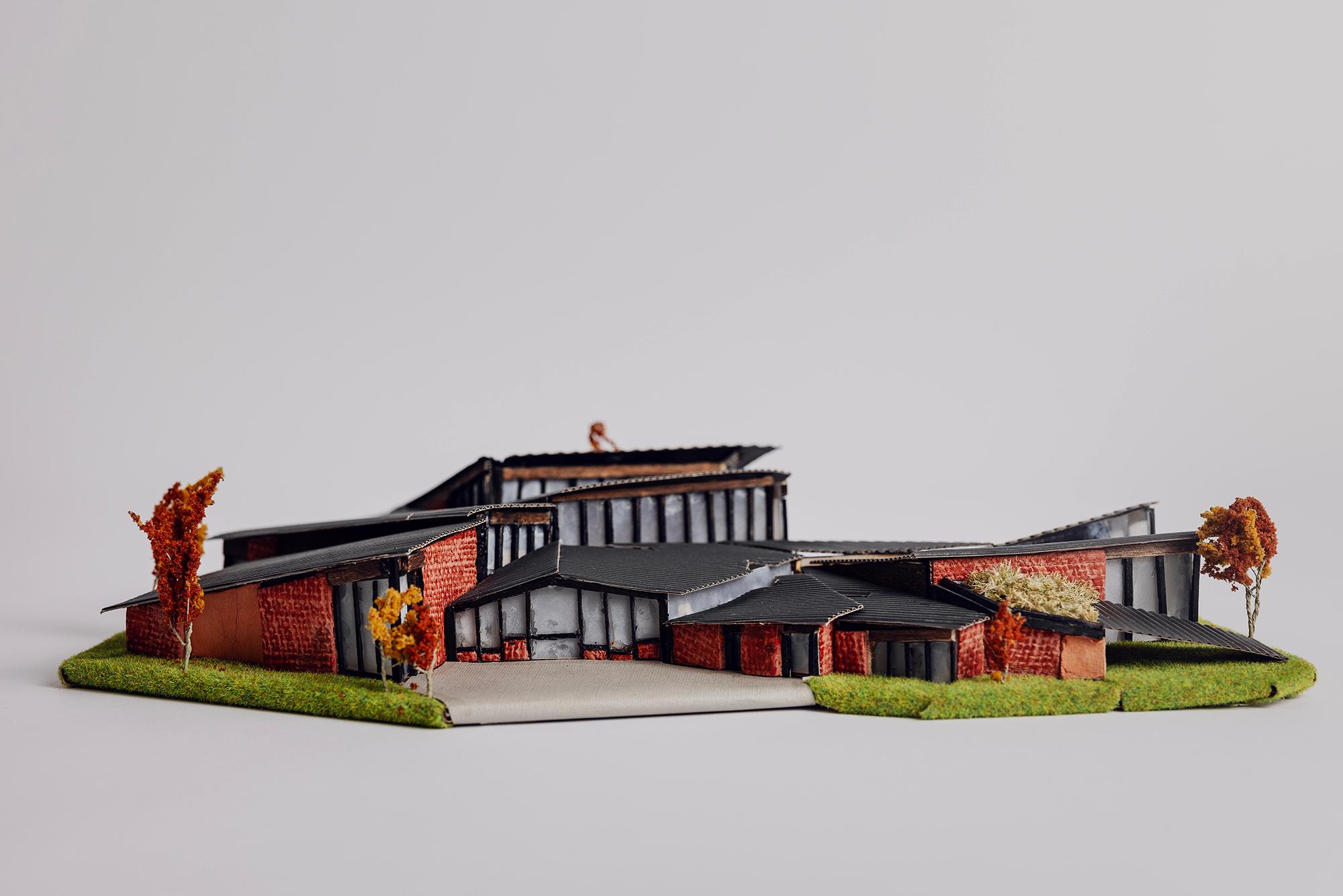
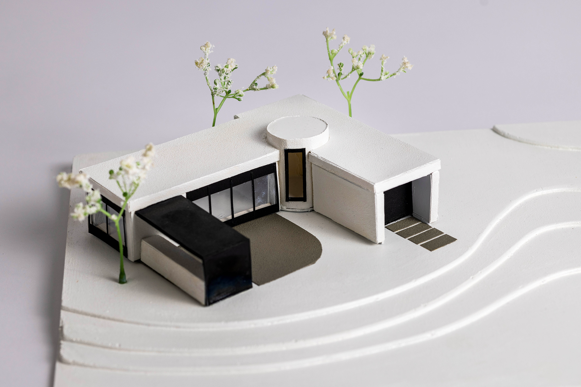
Brickhaus Brewery and Beer Garden
Architectural model and plans for brewery
Modelling clay, inkjet print, satin photo paper
Visual identity/Style guide booklet
Inkjet print, silk photo paper
Brickhaus Brewery required an architectural design as well as a visual identity that encourages local gathering and community entertainment. I used a combination of both digital and manual modelling methods to present the brewery design. By using consistent geometric forms within the building, the client’s brand identity (and original typeface) incorporates minimalist shapes, ensuring the brand is easy to read and can be applied in various contexts.
Avaya Pola
Huntingtower School, Mount Waverley
Wurundjeri Woi Wurrung Country
Aqua Wings
Banner and flyers
Canson Photo Paper Pro Lustre 260gsm, matte recycled paper 100gsm
Floatation device and poster
Waterslide Decal Paper, Canson Photo Paper Pro Lustre 260gsm, PLA filament, spray paint, magnets
Aqua Wings enhances young children’s water knowledge and safety. Modular floaties provide tactile engagement tailored to age and ability, while their bright, sustainable design ensures visibility. Informational flyers and banners guide parents on proper floatie use while capturing children’s attention with playful characters. By combining safety, fun and sustainability, Aqua Wings fosters a human-centred approach to water awareness for all ages.
Caitlin Bouwmeester
Padua College , Mornington
Boon Wurrung Bunurong Country
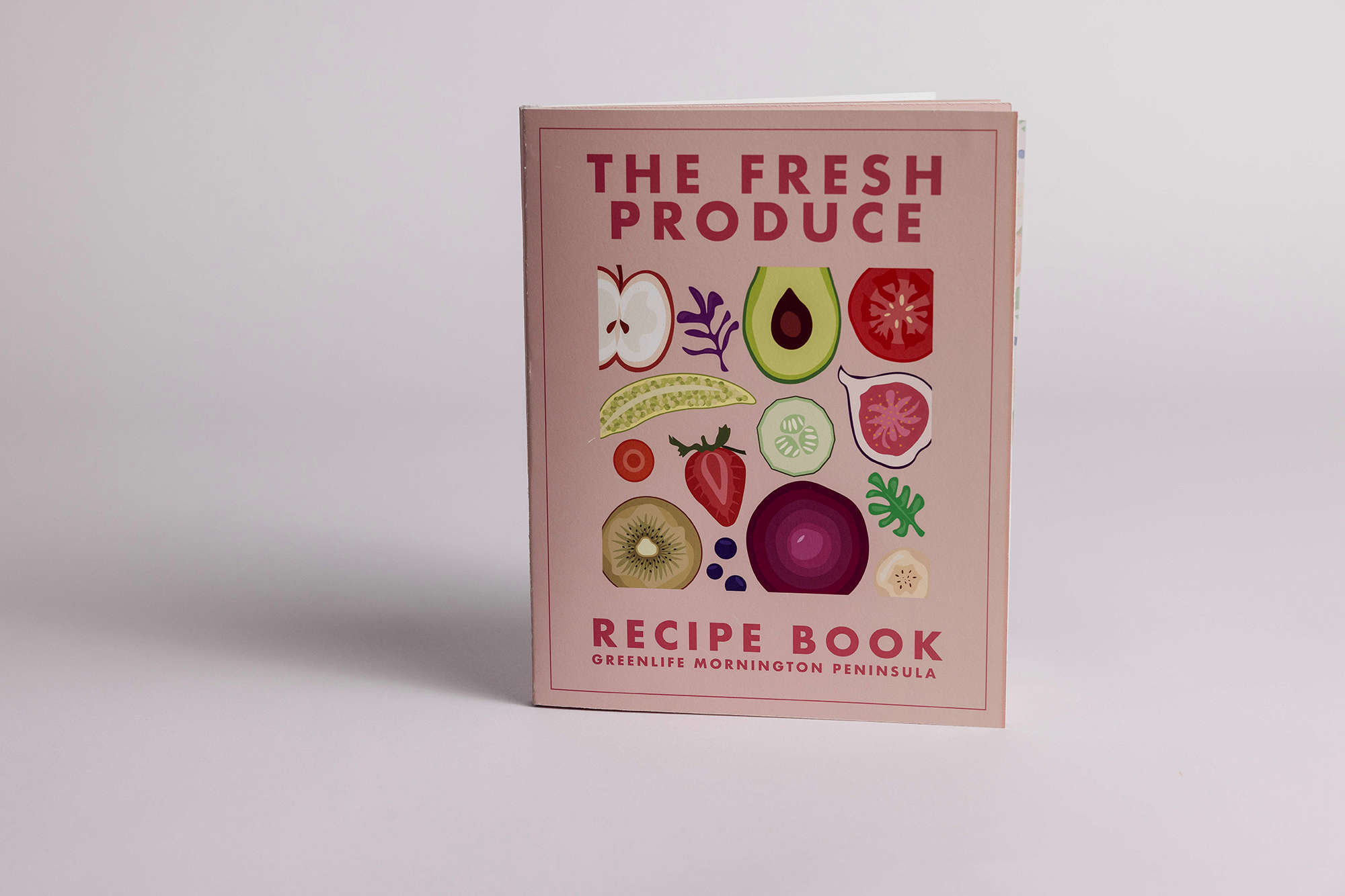
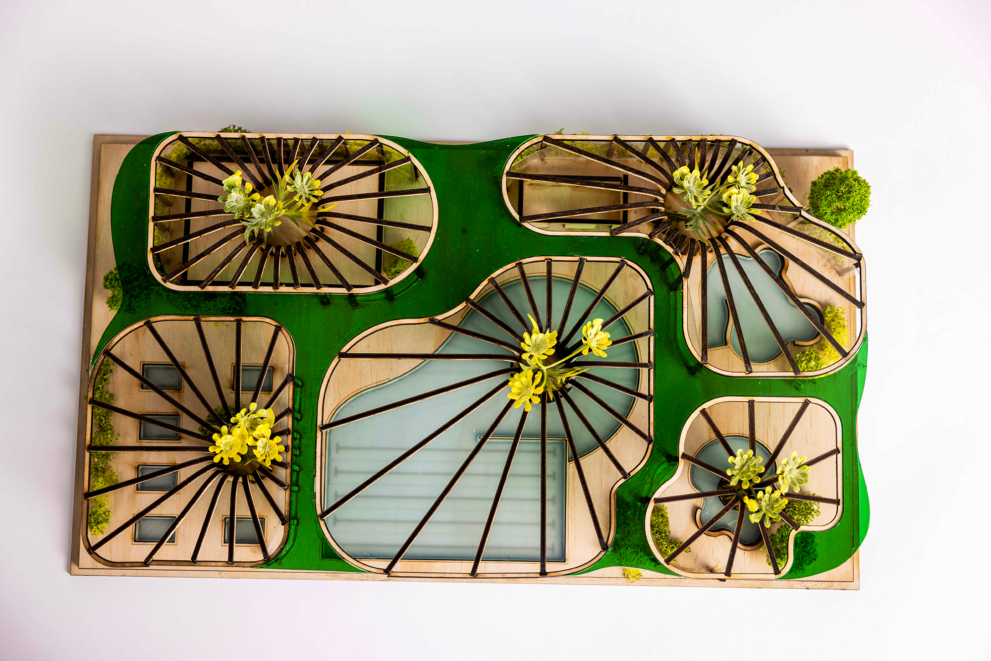
Greenlife Mornington Peninsula
Recipe book presentation board and prototype
Inkjet print, card, paper
Community Garden site plan and model prototype
Inkjet print, paper, balsa wood, cardboard, model-making materials, artificial
moss
Greenlife Mornington Peninsula required a recipe book promoting healthy eating through locally sourced produce. The design includes vibrant digital illustrations, clear typography and nutritional information, making it both engaging and informative. Additionally, Greenlife sought a community garden design to foster connections, promote healthy eating, and encourage sustainable gardening. The garden offers a space for growing fresh produce, sharing knowledge and building community.
Catrin Walker
Williamstown High School, Williamstown
Boon Wurrung Bunurong Country
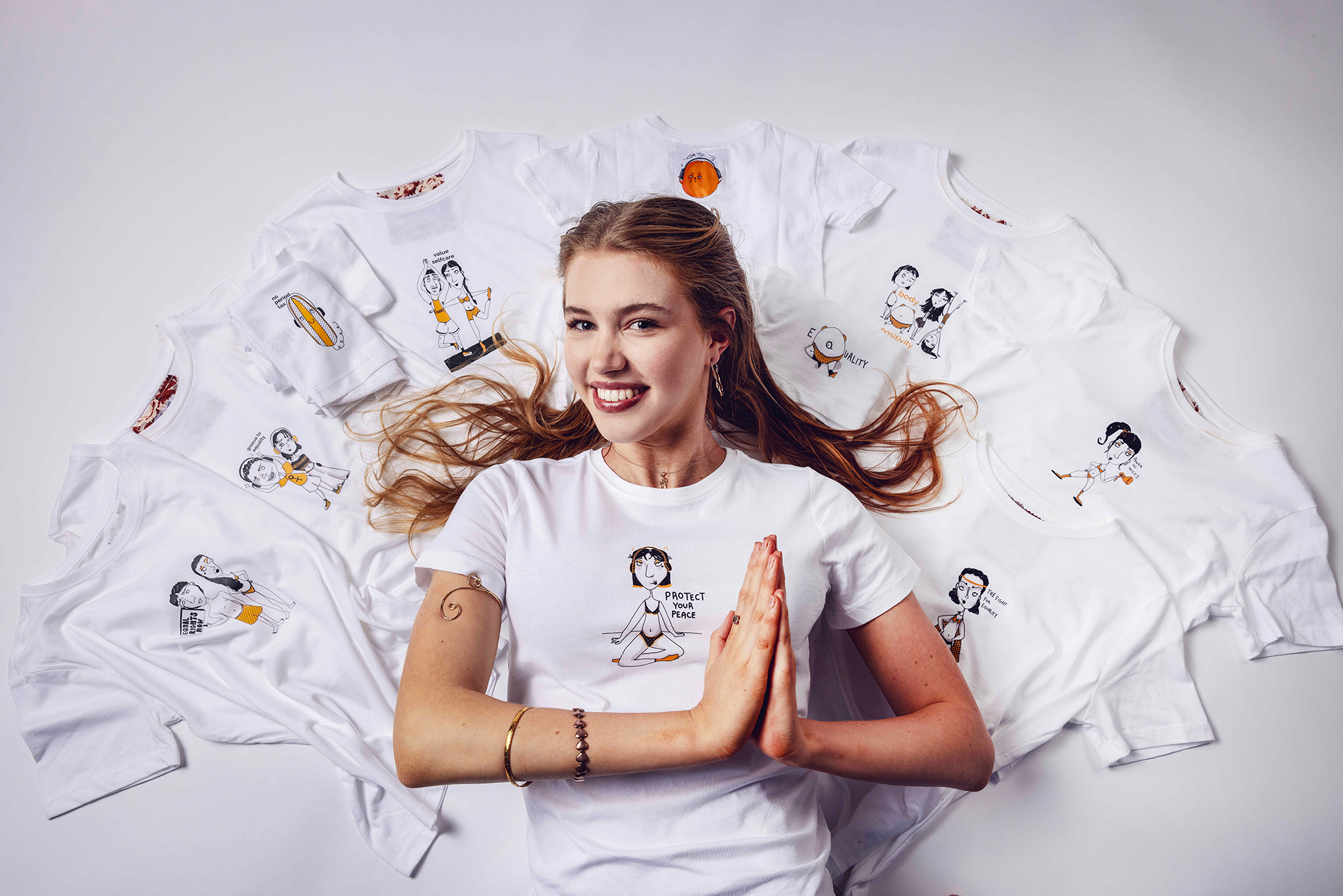
Our Guide to Feminism
My Guide to Feminism - activity book
Laser paper
My Feminist starter pack
Adhesive paper, cotton t-shirt
A feminist-themed activity book and starter pack informing and empowering youth on gender-related issues for Melbourne organisation 'FairPlay-for-Kids’. They provide engaging and interactive resources that encourage and facilitate critical, empathetic and creative discussions on social-justice issues. The activity book, filled with feminist media and thought-provoking tasks, in combination with the illustrative pack, allows users to wear their values, and equips educators, community stakeholders and parents/guardians with the tools to guide and entertain young children through the world of gender.
Charlie Scott
St Joseph's College, Newtown
Wathaurong Wadda Wurrung Country
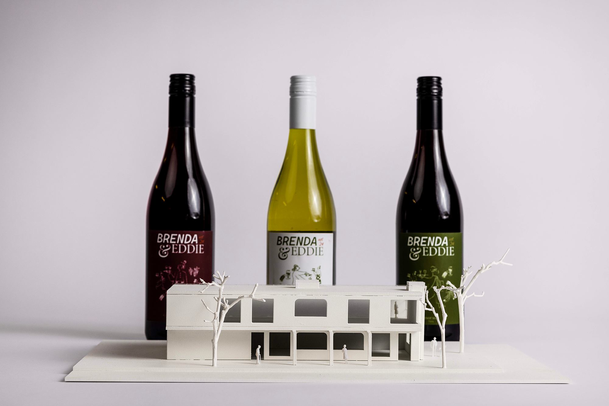
Brenda & Eddie Wine Bar
Brand identity, packaging and advertising
Inkjet print, paper
Architectural design and model
Inkjet print, paper, MDF board
Brenda & Eddie Wine Bar required the design of a brand identity and packaging, with the inclusion of advertisement posters targeting individuals aged 18 to 35 years. The wine bar also required an architectural design with a physical model to deliver the final concept. Using a combination of digital and manual methods throughout the design process, a handmade and artistic aesthetic was developed, catering for a creative-minded and Melbourne-based audience.
Dennis Da Lay
Melbourne High School, South Yarra
Wurundjeri Woi Wurrung Country
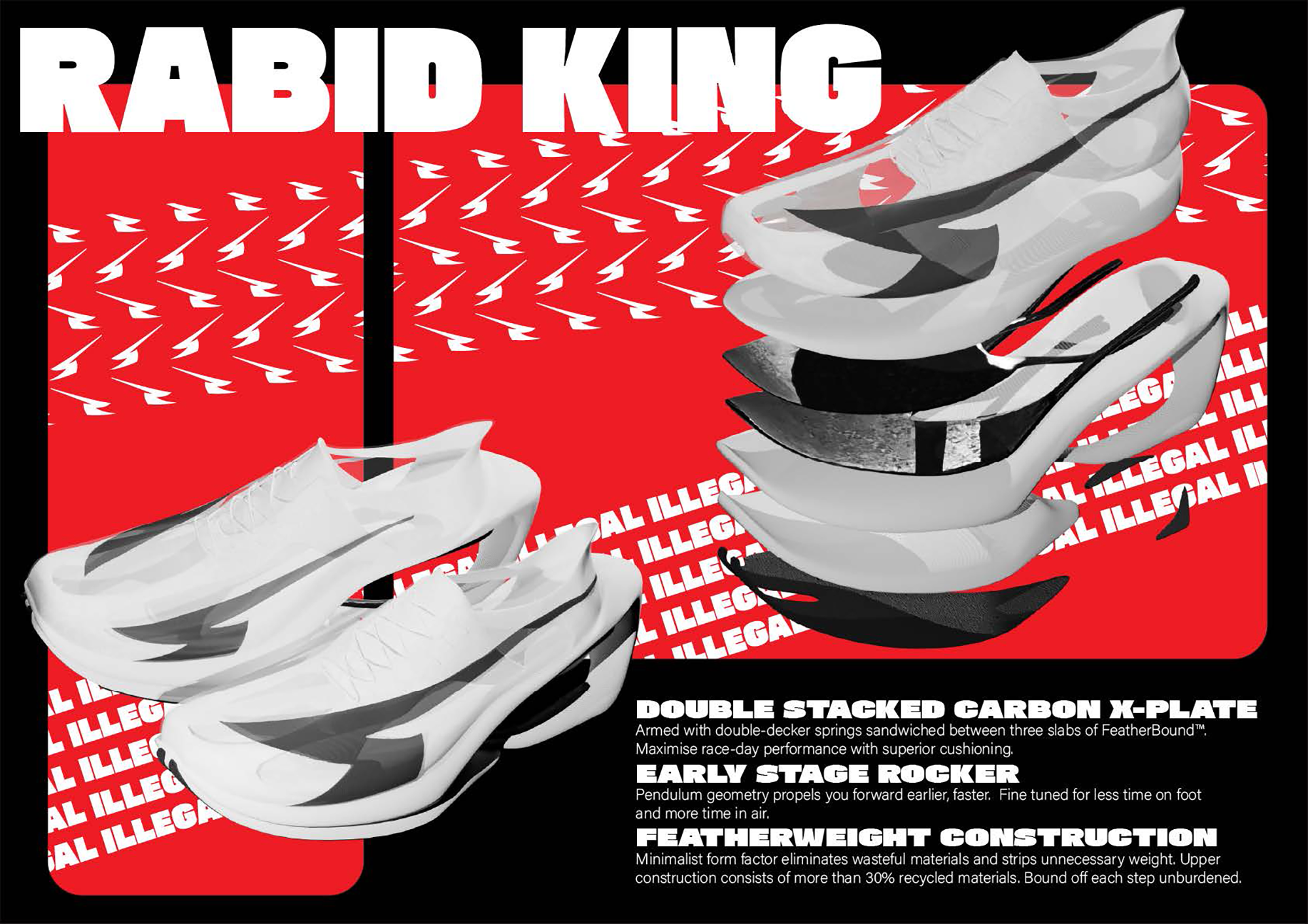
Rabid King Super Shoe
Race day super shoe
Inkjet print, video
Promotional poster and logo
Inkjet print
Rabid King is a startup athletic brand that required a running shoe designed for hobby joggers – individuals who occasionally participate in events and want to experience top speed without limitations. I used a research-based approach to maximise the efficiency of the shoe while also considering ergonomic and functional aspects. The end result aims to deliver a responsive, rockered ride that propels the runner forward while still being lightweight and breathable.
Farah Hassan
Mount Waverley Secondary College, Mount Waverley
Wurundjeri Woi Wurrung Country
Embodied Ecologies
Chronicles UX design concept boards and 3D models
Inkjet print, foam core, paper, PLA filament
Hydrotherapy architectural presentation boards and model
Inkjet print, foam core, paper, plywood, perspex, acetate
Embodied Ecologies is a multidisciplinary research clinic dedicated to reimagining chronic pain treatment by viewing the mind, body and external environment as an interconnected ‘embodied ecosystem’, and challenging biomedical reductionism. The clinic required an interactive experience design to facilitate meaningful and collaborative communication about subjective pain experiences between those living with pain, specialists and family/friends. A hydrotherapy centre was also required, promoting accessible physical activity, social connection, and engagement with nature as fundamental rights for those living with pain.
Jac Ormes
Parkdale Secondary College, Mordialloc
Boon Wurrung Bunurong Country
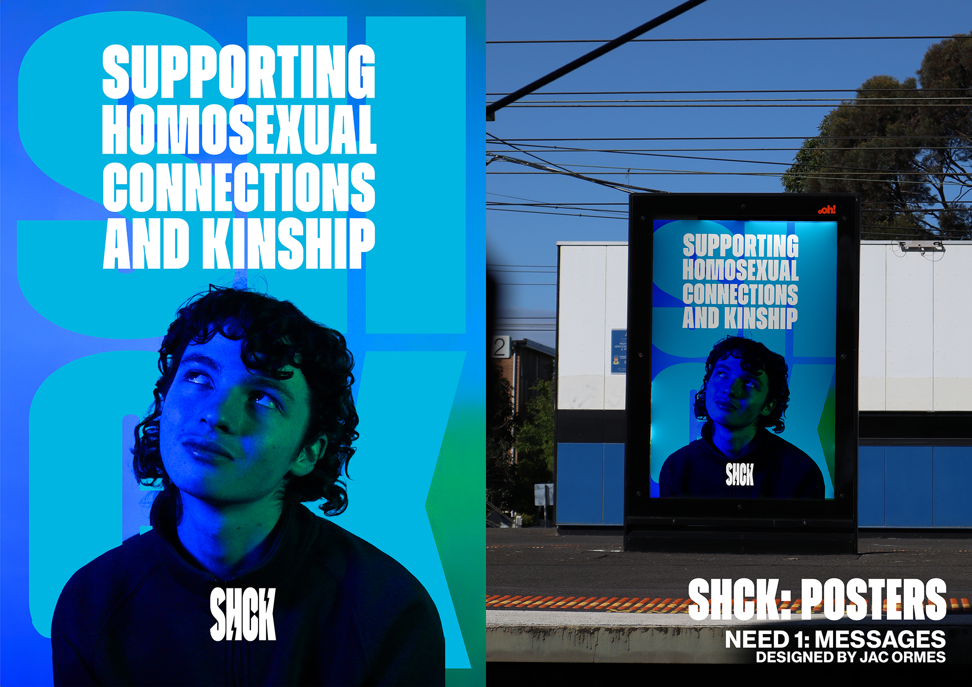
Shock Factor (SHCK)
Brand identity, brand guidelines and promotional material
Inkjet print, paper
Dating app user flow diagram, animation video, app icon board
MP4 video, inkjet print, card, paper
Shock Factor is an organisation supporting homosexual connections and kinships (SHCK) and striving to break contemporary taboos of homosexual monogamy. They required a brand identity, guidelines, a set of promotional material, an interactive app and customised icons. I designed the branding and promotional material using digital methods so that it can be displayed in Australian capital cities. I created the dating app using both digital UX and visual effects medias to intuitively solidify the interface for queer men across Australia seeking long-term relationships.
Leia Goldwyn
Swinburne Senior Secondary College, Hawthorn
Wurundjeri Woi Wurrung Country
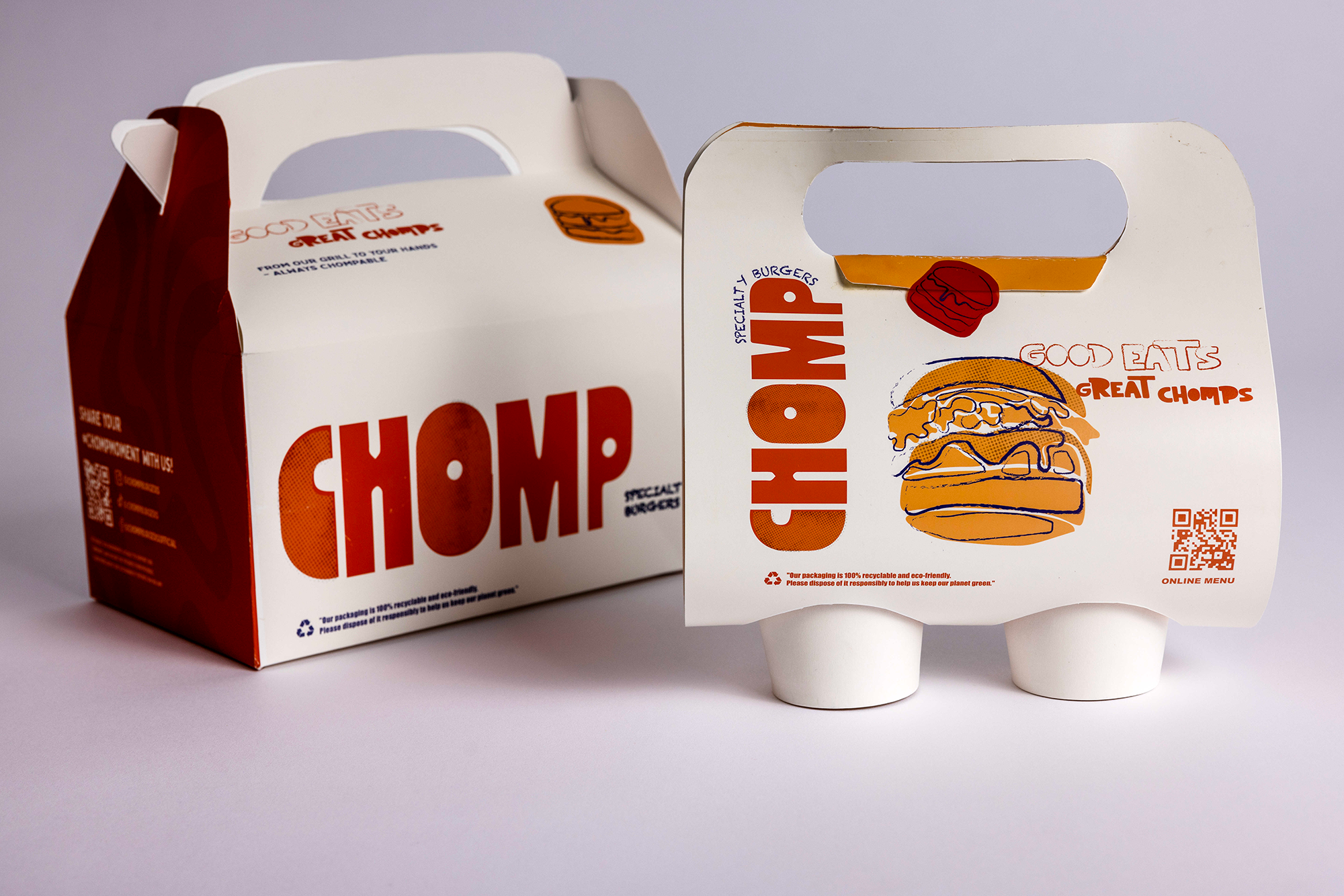
CHOMP Specialty Burgers
Product packaging
Inkjet print, paper, paper cups
App interface
Inkjet print, paper, card
Chomp Specialty Store required functional packaging and an interactive app interface tailored to their pop-up location in urban Melbourne. I used a combination of digital design tools and playful branding elements featuring vibrant reds, oranges, and interactive QR codes. Intuitive navigation and geolocation features are embedded in the app interface to focus on aligning with social media demographic.
Lily Cromie
Star of the Sea College, Brighton
Boon Wurrung Bunurong Country
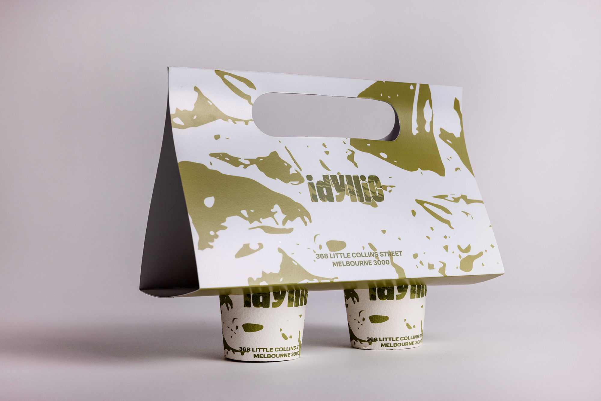
Vertical Park and Idyllic Cafe
Elevations, floorplan, site plan and model
Inkjet print, foam core, artificial foliage
Packaging and brand identity
Recycled paper card, inkjet print
AC Developers required the design of a vertical park space and cafe. Vertical Park and Idyllic Cafe is located in the heart of Melbourne’s CBD. Its design aims to enrich the lives of users by encouraging reconnection with nature. Natural and constructed components are ingeniously woven together in the park and café so that they act as an oasis – an outlet where city office workers and other visitors can relax, connect and explore.
Mak Krause
Bass Coast College, Wonthaggi
Boon Wurrung Bunurong Country
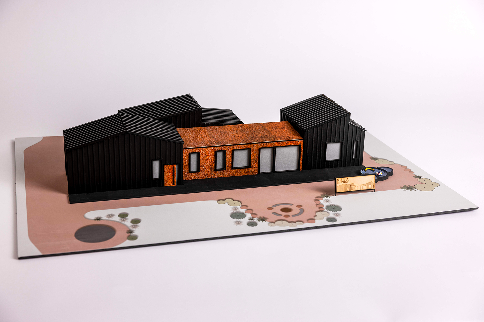
Bushfire Resilient Family Property
Scale model, presentation boards and client information booklet
Plywood, paste board, foam core, paper, inkjet print
Presentation boards and client information booklet
Foam core, paper, inkjet print
Bushfire Resilient Family Property is a design for a family home and landscape that could withstand the harsh environmental conditions of Australian summers. I incorporated contemporary and nature-inspired elements into the building and landscaping. Using a combination of digital and manual methods, I produced presentation boards that would be understandable to, and informative for, the client.
Noah Freeman
Northcote High School, Northcote
Wurundjeri Woi Wurrung Country

Cohab+ modular housing system
Architectural model and 3D renderings
Plywood model, 3D printing, inkjet print
Interactive design map poster
inkjet print
Cohab+ offers a solution to Australia’s housing crisis through quick-build modular homes. Two standardised steel frames (a whole and a half-size) act as the basis for a site-adaptable solution. Within the framework, prefabricated insulated panels – offered in a range of materials – separate spaces to create the physical and visual versatility necessary for diverse communities. The Cohab+ app guides developers through a streamlined design process, realising their project as they adapt the Cohab+ system to their specific site and resident needs.
Sascha Shashyan
Woodleigh School, Langwarrin
Boon Wurrung Bunurong Country
Amity Studios
Headquarters exterior design
Foam core, card, paper
Visual identity including a logo and promotional material
Foam core, card, paper
Amity Studios required an innovative exterior design fostering collaboration, along with a cohesive visual identity for business cards, signage, and a colour consult package. I incorporated a green room, abundant natural light, an open plan and outdoor seating, to create a peaceful, socially sustainable workspace for employees. The geometric logo design, paired with the modern, approachable colour pink, enhances professionalism. The pink-and-black contrast appeals to a younger audience, reflecting the brand's contemporary ethos and its commitment to design innovation.
Zoe Matzken
Star of the Sea College, Brighton
Boon Wurrung Bunurong Country
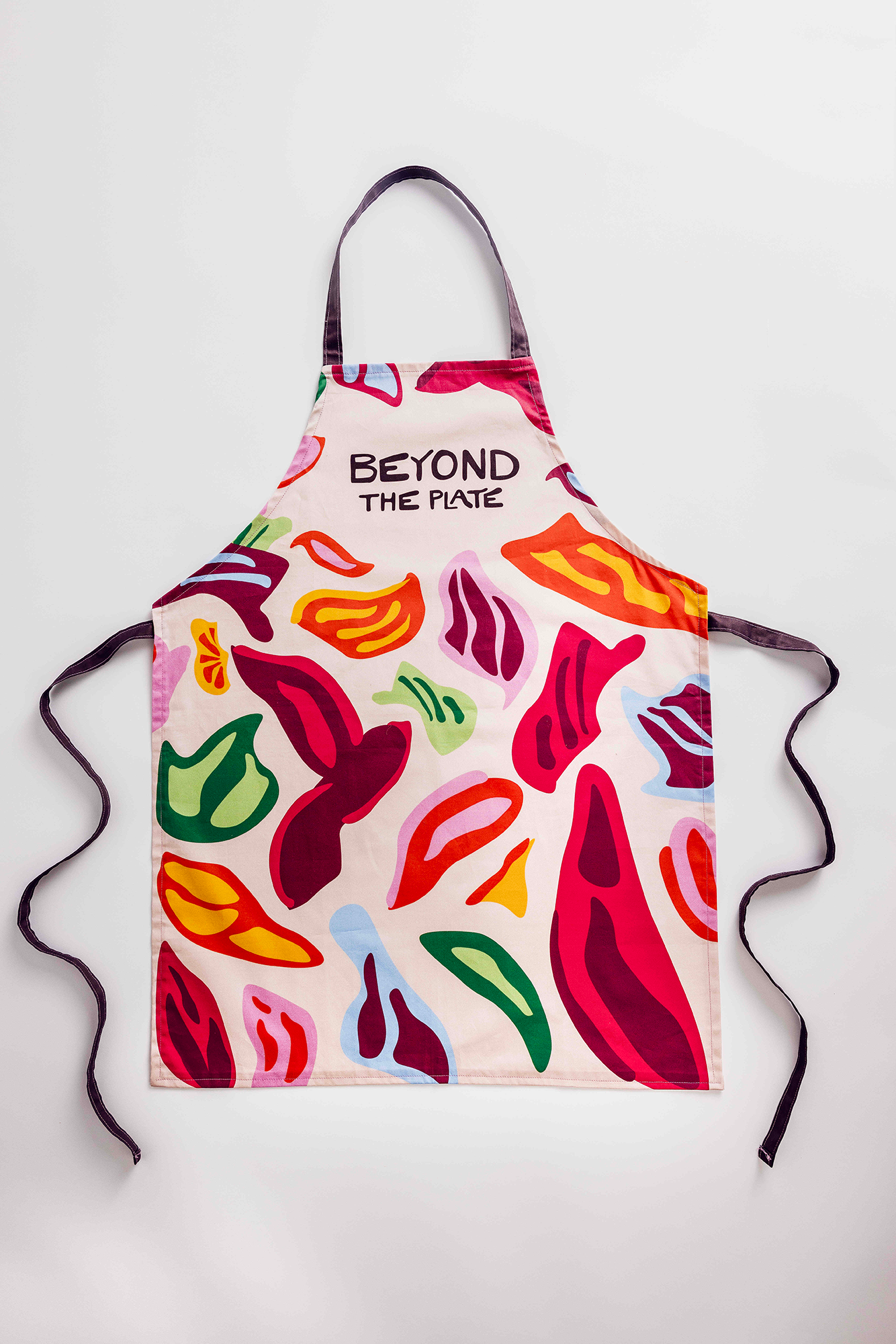
Beyond the Plate
Hub design on concept boards, virtual walkthrough
Foam core, paper
Brand identity applied on a poster and apron
Foam core, paper, plastic sheet, fabric
Beyond the Plate is a hub tackling loneliness, an issue faced by migrants and refugees that often stems from the loss of established support networks. To address this, the hub facilitates shared cooking experiences where individuals from all backgrounds gather with the common goal of preparing and sharing meals; a practice that transcends barriers. The hub was designed to be inviting, promoting interaction and the sharing of cultures, while the brand identity reflects the diverse nature of its users coming together.